Compiled by Team IAnD
Photography: Dadu’s Kondapur; courtesy RMDK
Read Time: 2 mins
 |
| . |
Ravish Mehra Deepak Kalra (RMDK) design studio seems to have mastered the art of designing a balanced mix of retail cum hospitality experiences as they revitalize mithai (sweetmeat) stores keeping the brand relevant to the present market scenario…
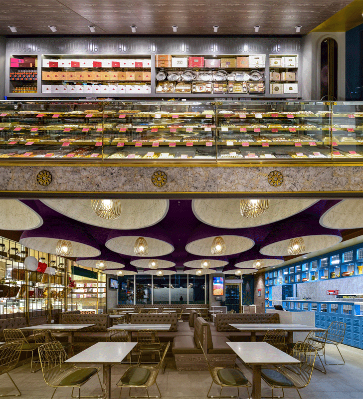
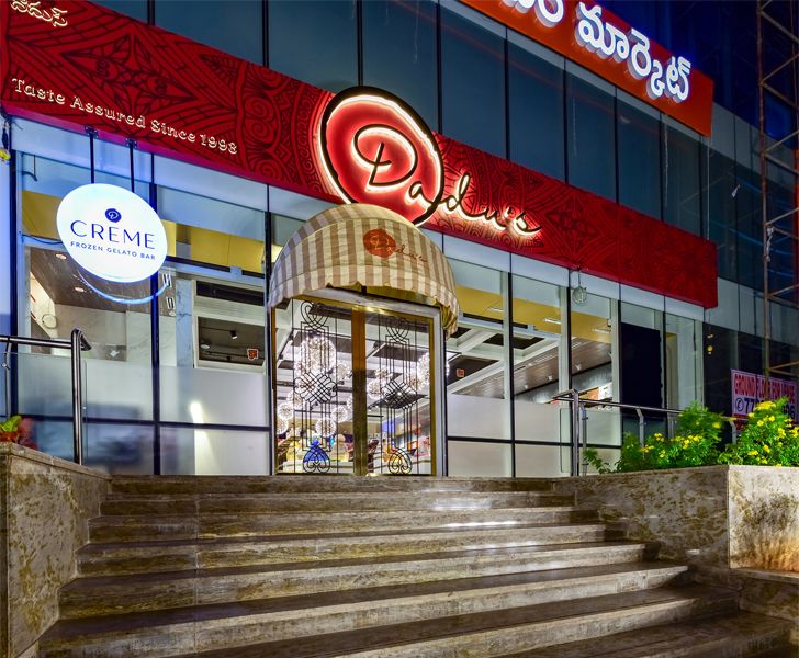
At Dadu’s in Kondapur, Hyderabad, the design revolves around a deliberate indulgence as if reinventing the grandeur of the city of Nizams to represent the new emerging face of Indian contemporary luxury. And in this, the space stands out for its very understated attention to detail that avers to much more than meets the eye.
The linear rectangular layout is divided into two major zones: the retail space that unfolds at the entrance and the restaurant relegated towards the rear – each distinctly characterized by a wide array of materials, colours and textures establishing harmonious zoning, circulation and visual flow.
 |
| . |
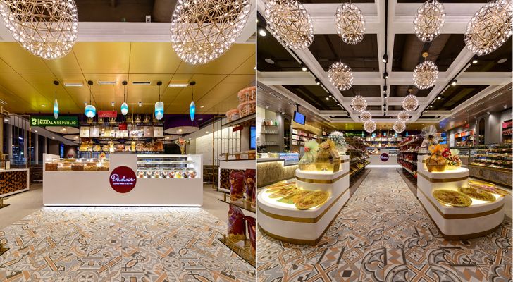
The main entrance opens into an alluring, yet functional space flanked by custom-made display counters that give a quick overview of the entire product range. A surprise element props up as you pay attention to detail; viz., fine grooves on the surface of the stone clad ice-cream display that reflect play of light and shadow, adding depth and charm to its patterns and texture; playful natural striations and patterns on the marble clad sweet display counter with geometric metallic pattern overlays - an innovation on the indigenous stone construction techniques, and reminiscent of the city’s splendid architectural heritage.
 |
| . |
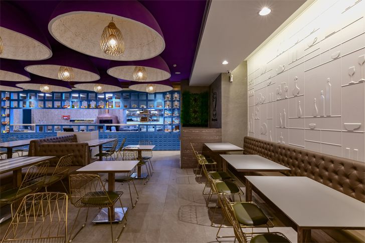
As arty patterned tiles visually guide the customer to a smaller feature display and cash counter behind, which forms the entrance to the restaurant, the subtlety and narrative is sustained as a lush jewel-toned color palette of purple, blue, green and gold is well balanced with neutral white and brown shades, creating a memorable and theatrical dining experience. Its interiors are influenced by the context of the city’s numerous monuments with domed ceiling installations and a wall anointed with a modern-day relief - a clean, geometric and minimal take on vernacular art and decor, readjusted to the brand’s context, creating stunning visual narratives of their culinary experience.
 |
| . |
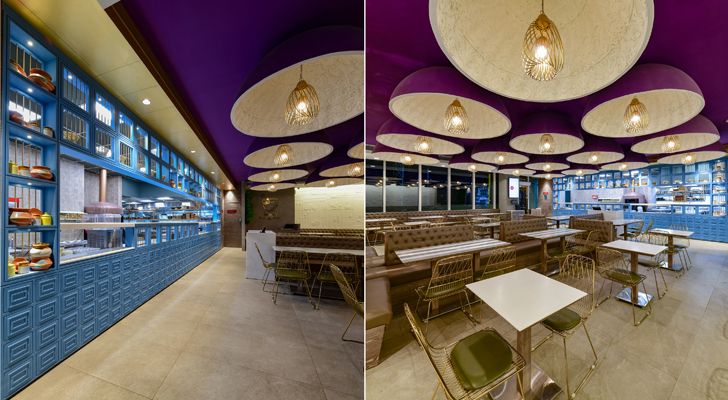
The restaurant’s ceiling is a showstopper as each purple toned dome with delicate relief work in white encloses a household-lantern-inspired pendant light, creating a uniquely indulgent ambience. A curated pattern of window openings and solid surfaces in the vivid blue service counter defines a stark contrast, contributing to a fluid visual highlight; effortlessly creating an inside-outside flow and converting an otherwise mundane cooking activity into a live art exhibit.
 |
| . |
Aimed at reimagining Indian heritage into a cozy yet international retail experience, Dadu’s boldly goes beyond the expected to blur the boundaries between the old and the modern. It deftly highlights the importance of contextual relevance of every project and its effect on both - the urban fabric and brand identity.
Fact File:
Project Name: Dadu’s Kondapur
Design Firm: RMDK
Project Head: Dhruva Kalra
Team Members: Preeti Negi, Rhea Bordoloi
Area: 4800 sq. ft
Location: Hyderabad, India

No comments :
Post a Comment