By Marina Correa
Photography: Sameer Chawda; courtesy Kinteriors
Read Time: 2 mins
 |
| . |
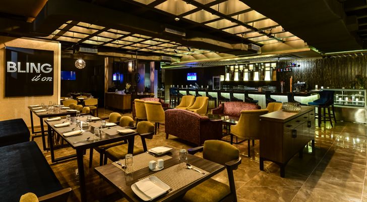
Kinteriors refurbishes three disparate areas into a swanky restaurant-cum-bar within a gymkhana in a posh Mumbai suburb…
Any project that deals with refurbishment comes with a long list of inherent constraints and this one is no different. Principal designer Kanchan Fagwani of Kinteriors handles the challenges with aplomb as she swaps expensive materials for cost-effective ones without compromising on the look-and-feel of the space.
 |
| . |
 |
| . |
 |
| . |
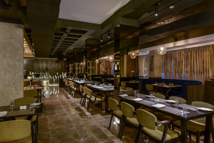
Beginning by breaking down all obstructing walls to create a seamless space with zones for fine dine, lounge-cum-bar and reception and lobby, she creatively designs the one area that could not be rid of its columns – the parking lot – by optimising seating around the repetitive columns. With a brown-tinted-mirror-clad table between two columns, she ensures cosy privacy and a visually lighter and pleasing aesthetic.
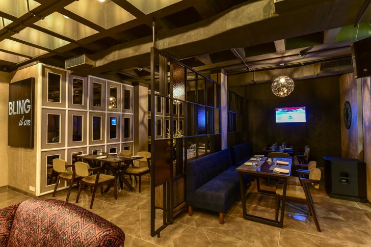
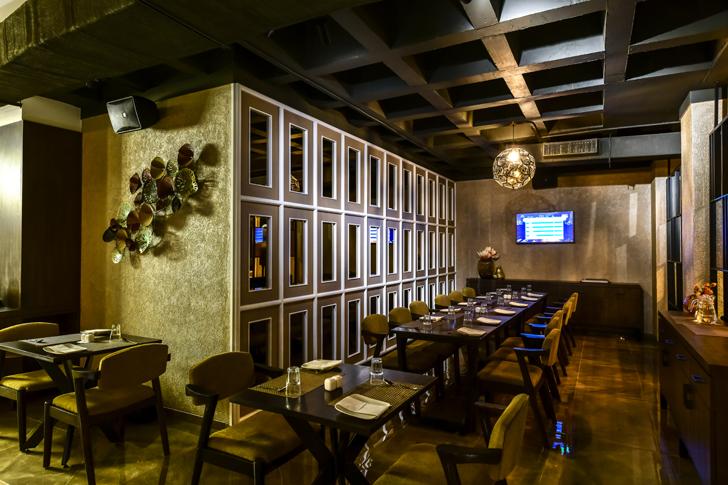
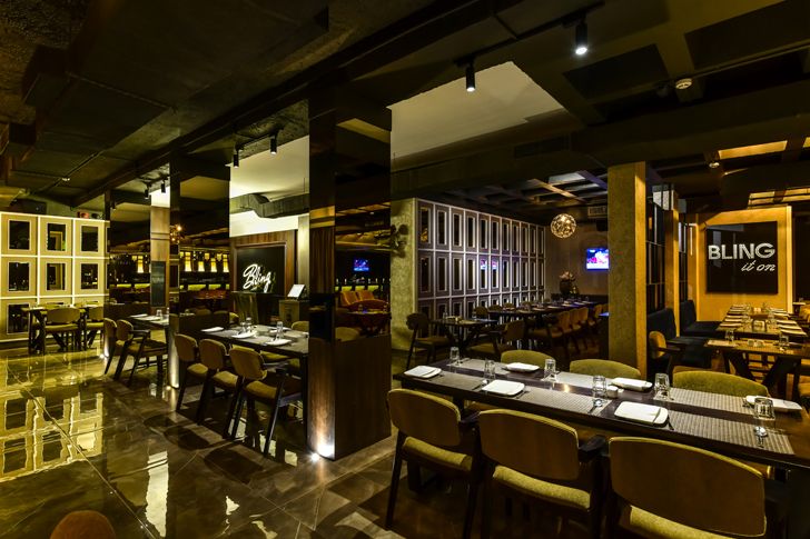
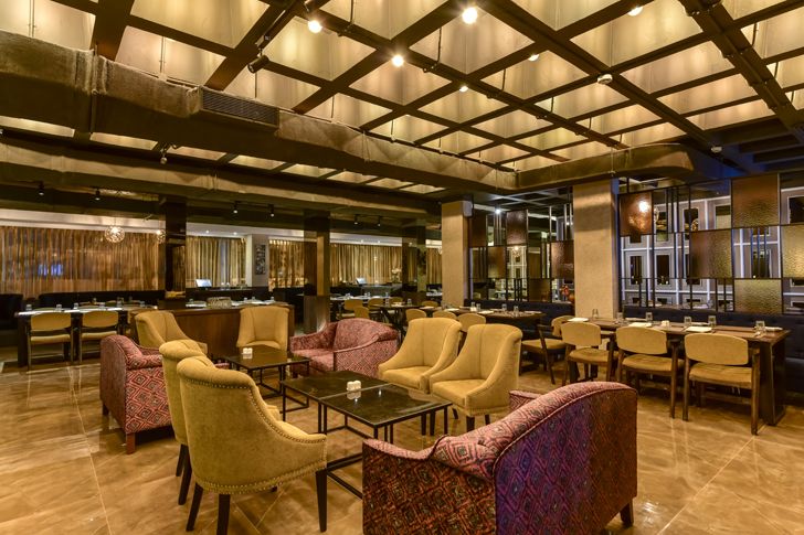
Merging three diverse ceiling types to cull out an exposed ceiling proved too cumbersome; instead, she retains the original waffle slab ceiling (of one area) and positions the reception-cum-lobby here. Besides, dimmed filament bulbs used within each of the waffle squares transform the ceiling into a highlight feature and subtly demarcates it from the rest of the space.
 |
| . |
 |
| . |
 |
| . |
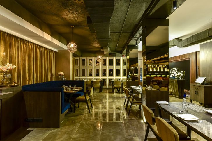
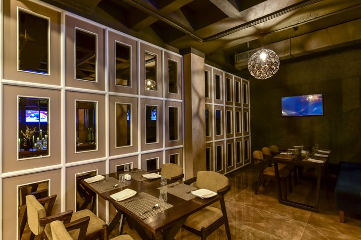
Kanchan employs a cost-effective strategy, where she camouflages air-conditioning ducts with gunny bags and layers them with dark grey paint for an even finish! Another ingenious solution comes in the guise of glossy floor tiles as the economical option to a marble look, whilst beige paint with a shine-finish imparts a rich aesthetic to the neutral walls. Upholstery in khaki green, navy blue and printed pink enlivens the space and select seats use studs for the right punch. White moulding frames hosting brown-tinted mirrors don the arty hat to further accentuate the aesthetic.
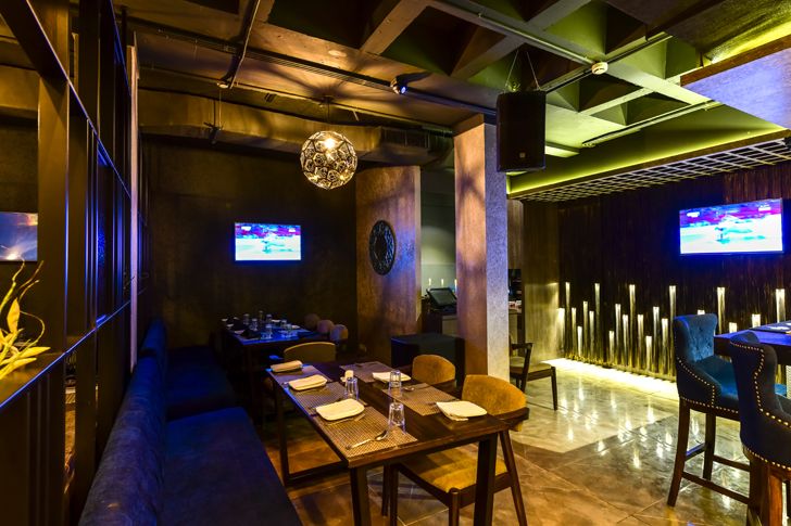
Despite the shine and shimmer, gaudy is not on the list. This is mainly because balance is integral to the design. For example, the bar clad with golden tiles is juxtaposed against a black galaxy granite counter top. Similarly, the Swarovski lettered signage is etched across a jet-black acrylic background whilst all other luminous elements harmonise against brown laminate and veneer furniture.
 |
| . |
 |
| . |
 |
| . |
 |
| . |
Simple nuances transform into accent features such as the delicate flutes (made of MDF) on the background wall of the bar; glossy paint-and-mirror wall treatments; choice of filigree orb metallic chandeliers; partially permeable metallic screens and the like.
In the grand scheme of things, lighting plays the hero - from diamond-shaped filament bulbs (finished in tea-colour) to one-watt LED bulbs and uplighters to track lights and dramatic chandeliers…culling out a stylish dining experience, where celebration could be the norm!
Fact File:
Client: Anant Ganediwal and Anisha Anand (from Aurum Foods Pvt. Ltd.)
Design Firm: Kinteriors
Principal Designer/Architect: Kanchan Fagwani
Area: 3,000 sq. ft.
Location: Juhu Vile Parle Gymkhana, Juhu, Mumbai

No comments :
Post a Comment