By Marina Correa
Photography: Anand Jaju for BBH project and Pallon Daruwalla for Workzlab project; courtesy the architects
Read Time: 3 mins
Ar. Nisha Matthew Ghosh uses an analogous approach to chisel two disparate typologies using a few standard elements to cull out the essence of their individuality…
A community health, research and training centre in the 4,000 sq. ft. Bangalore Baptist Hospital (BBH) and Workzlab, a co-working space are treated as individualistically as they are anointed with similarities in design approach.
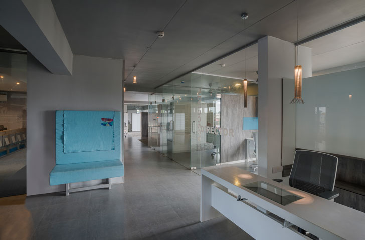 |
| Community Centre at Bangalore Baptist Hospital |
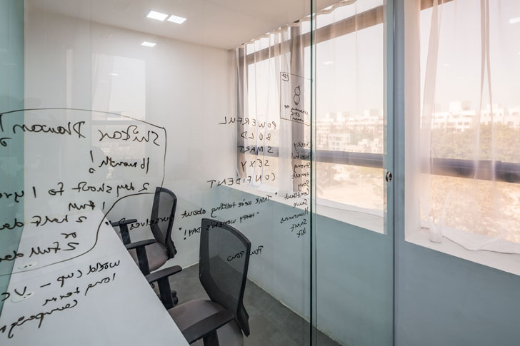 |
| Workzlab |
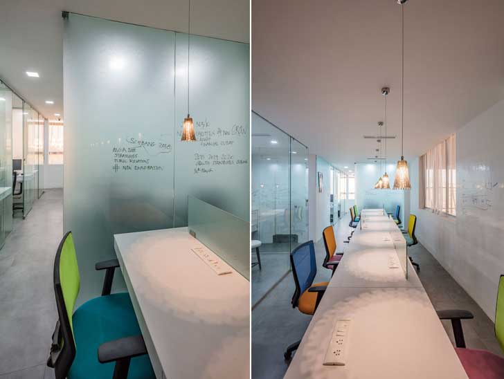
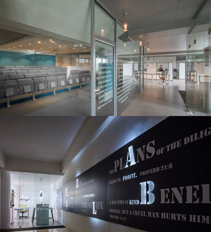
To begin with, glass partitions for transparency and visual connectivity open up the hospital community centre, whilst white glass - reflective and refractive writing surfaces maximize natural light in the co-working space.
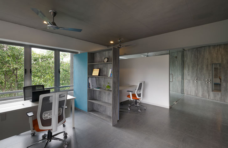 |
| Community Centre at Bangalore Baptist Hospital |
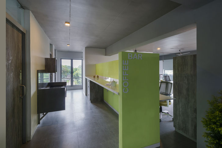 |
| Community Centre at Bangalore Baptist Hospital |
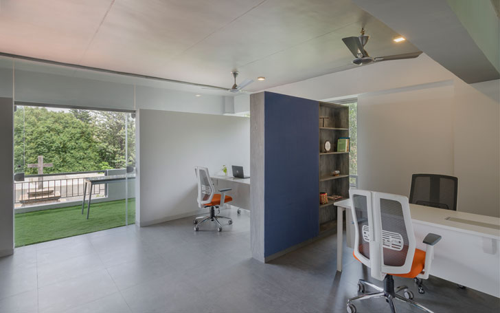
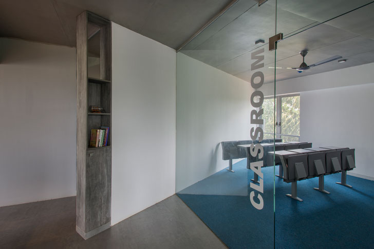
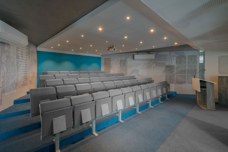
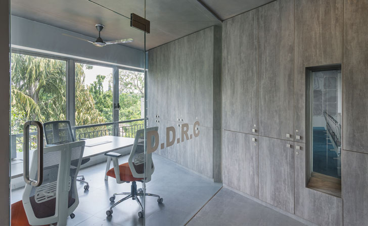
A well-articulated play of deep tones is contrasted against natural light. At BBH, the trapezoidal stepped transparent community space, representative of its charitable core, is deliberately enveloped in warm hues of dark tones and juxtaposed against the rest of the open spaces -- which are evocative of a large light-washed ‘verandah’ anointed with loose open-ended walls; referencing traditional social spaces of Bengaluru’s bungalow typology.
 |
| Community Centre at Bangalore Baptist Hospital |
 |
| Community Centre at Bangalore Baptist Hospital |
Colour becomes an effective medium to balance warmth with coolness; cosiness with openness and as subtle demarcations of different areas within the overall schematic. For instance, charcoal grey and deeper blues anoint the central community area, the all-enclosing envelope is a simple white plaster reminiscent of chuna colour, while a splattering of colour creating points of focus is seen in sofa fabrics, pin-up boards, coffee bar and the like.
 |
| Workzlab |
 |
| Workzlab |
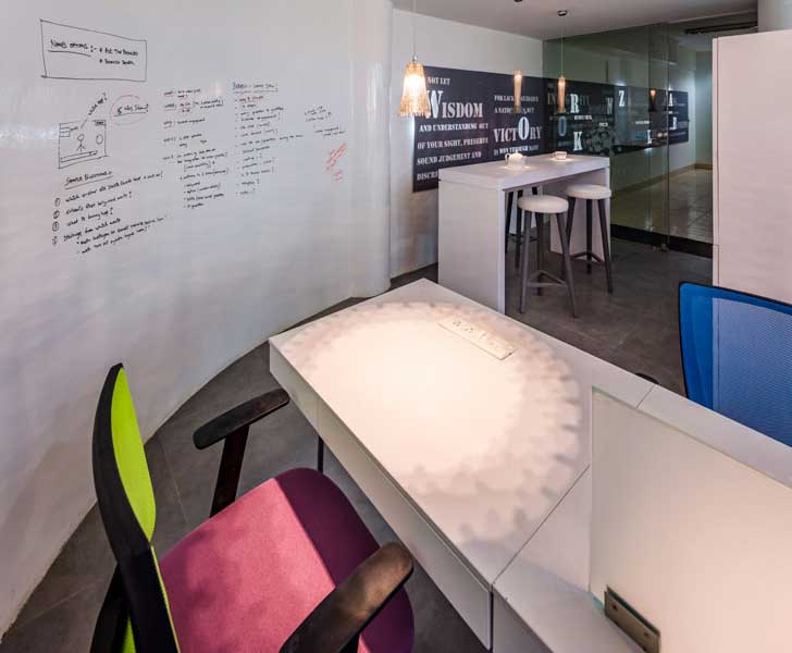
On similar lines, at Workzlab, Nisha makes a virtue of the dingy corridor by treating it as the darker foreground and ‘brand backdrop’ leading to a light-washed co-working area. Commonplace objects such as the mundane standard swivel chairs of an office environment are given a peculiar individuality by creating a collage of colours that in turn becomes a place of visual ownership for the users. This is offset against a palette of glass writing surfaces which create multiple translucencies. In addition, woven stainless-steel pendants create localised warm pools of light to give identity to each desk in the common area.
 |
| Community Centre at Bangalore Baptist Hospital |
 |
| Community Centre at Bangalore Baptist Hospital |
Both projects incorporate special features layering them with character. In the BBH project, flexibility is subtly woven into the central core which doubles up as a seminar station, when needed, yet remains visually connected. Similarly, cubicles for various personnel and functions are simply delineated via storage units and glass partitions. Another poignant feature is the Anah handcrafted lights that underline the narrative of traditional communities as ‘makers’.
 |
| Workzlab |
At Workzlab, accommodating 20 people (with individualistic social mindsets) into a tight 740 sq. ft.space whilst simultaneously creating a shared hub of ideas viz. the ubiquitous glass surfaces that double up as ideation boards, is its highlight.
Overall, even though both projects cater to different functions and social mindsets, the singularity in a comparable approach brings forth an interesting narrative.
Fact file:
Design Firm: Mathew and Ghosh Architects
Principal Architect: Nisha Mathew Ghosh
Project BBH
Client: BBH- Kurien Foundation: Community Health Research and Training Centre
Design Team: Nishi Kumar, Gaura
Built-up Area: 4,000 sq. ft.
Location: Bellary Road, Bengaluru
Project Workzlab
Client: Govind Jha
Built-up Area: 740 sq. ft.
Built-up Area: 740 sq. ft.
Location: Near old airport road, Bengaluru

No comments :
Post a Comment