
By Savitha Hira with inputs from Neehar Mishra
Photography: Courtesy HB Design
Read Time: 2 mins
 |
| A-Z of graphic gamut at HB Design |
Award-winning firm HB
Design Pvt. Ltd. delves into their success-rated portfolios to share with us
some insights into what makes for the ‘right’ business communication design!
In a world, where attention
spans are drastically decreasing, effective business communication demands not
only succinctness, but dynamic packaging that grabs eyeballs instantly. This puts
the onus of the ubiquitous ROI largely on design firms, which need to present information
a la elevator-pitch style; engaging
both, visually and emotionally with the sole aim of eliciting a positive
response.
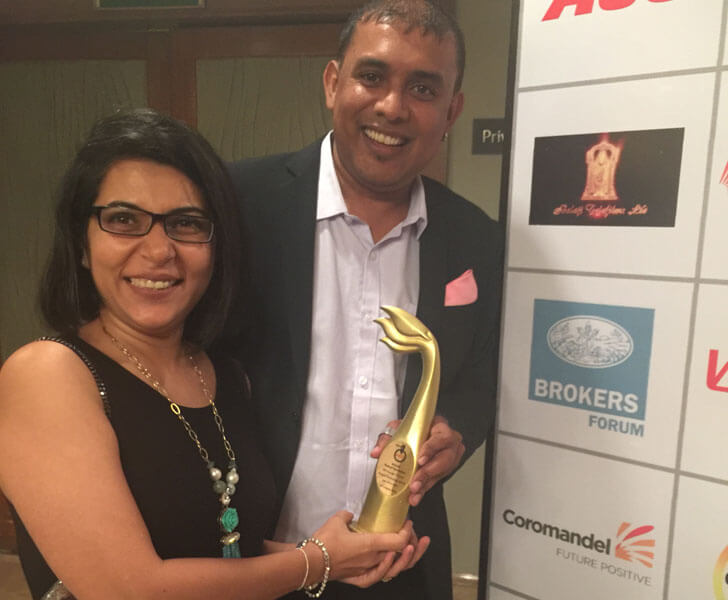 |
| Rupa Manek & Sajid Moinuddin with their recent Gold |
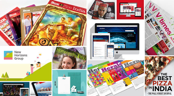
With 7 awards in 9 years, Mumbai-based
HB Design Pvt Ltd, is the recent recipient of the Gold in the ‘Desk calendar’
category at the 56th Annual Association of Business Communicators of
India (ABCI) Awards. Aced up to deliver the A to Z of corporate communication –
from 3600 branding (fundamental to peripheral) to environmental
design (an inclusive discipline in graphic design) to dynamic detailing that
bogs the realm of print and digital mediums, the firm is known to deliver on
the principles of ‘simple, minimal and impactful’!
 |
| . |
 |
| . |
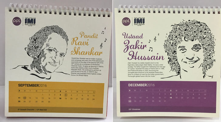
Their current win is the
2016 table-top calendar titled ‘An Ode to the Legends’ for broadcasting licence company, Phonographic
Performance Limited and comprises portraits of India’s musical greats made
using musical notes. Regarding this as the firm’s most exciting project,
creative director Sajid Moinuddin (son of Late M. G. Moinuddin – India’s
legendary publication designer, who is credited with several leading masthead
designs – Sunday Times being still in use) explains that while the brief was,
as in most cases, fairly open, the concept of musical notes mandated black and
hence colour became a sparse commodity here.
Attributing the success of
a design to an optimum product study across several branding and market-driven
parameters, Sajid confirms that the onus of a campaign is multi-layered, making
‘focus’ the single-most success ingredient that drives
creative vision within set brand guidelines.
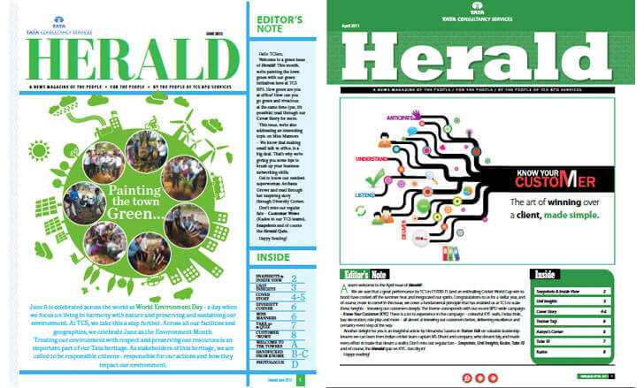 |
| Newsletter for TCS |
Their monthly in-house
newsletter for TCS, which has won three awards till date, sustains the
corporate look and feel but the colour and font palettes are friendly,
comfortable and attractive.
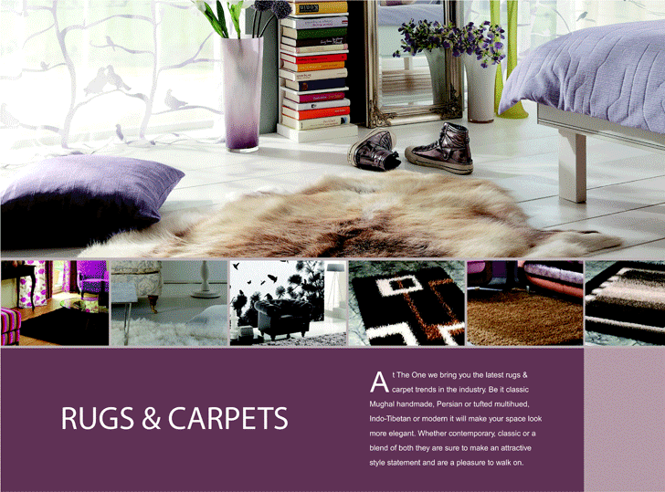 |
| Brochure for The One |
A lot goes into selecting the right fonts and colours, explains Rupa
(Director and Sajid’s better half); and these specifications, when strictly
adhered to, sustain across-the-board brand quality and authenticity. Their brochure design for interiors and
furnishings store The One, another award-winner, uses visual strength with
brief text as its mainstay; establishing the brand’s principles of affordable
luxury.
As Sajid reaffirms
- every designer needs to be armed with an open mind and good storytelling
skills to make sure his work truly stands out. And, at all costs, avoid
clichés!
It is a great website.. The Design looks very good.. Keep working like that!.
ReplyDeleteCommunication is very important part of business and without proper business communication, no business can survive. So we should focus on proper business communication modes.
ReplyDeleteAs with any other professional document, you should avoid using flashy fonts in the body of your profile. These can be distracting and hard to read. Go with an attractive, simple font like Arial, Helvetica, or Calibri.
ReplyDeleteAwesome post. Best creative work
ReplyDelete