By Marina Correa
Photography: Santhosh Kanadala; courtesy Spacefiction
Studio
 |
| . |
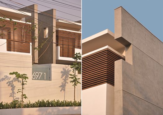
Flat wooden members
juxtaposed against concrete planes; cantilevered spaces and asymmetrical voids
define the elegant façade, whilst a north-facing court and an internal bridge
lend strong architectural character to this U-shaped home in Hyderabad…
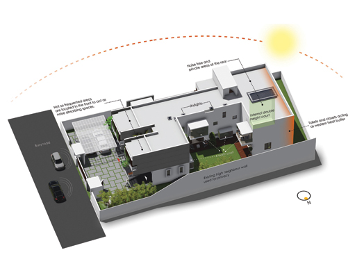
Situated on a linear plot along
a busy road in a region, which faces harsh summer, the architects were delighted
to use the high neighbouring wall that blocked out severe sunlight on the north
side as a point of take-off for the design of this 6500 sq. ft., two-storey
residence.
 |
| . |
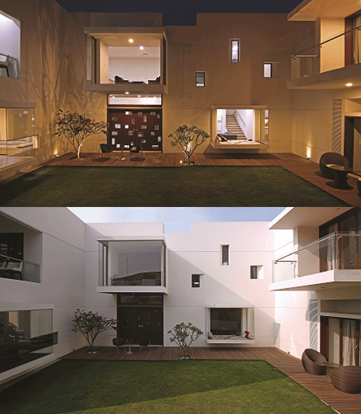
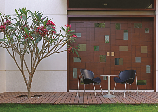
They carved out a north
court with glass-box-like projections, a wooden deck and voids punctured into
the façade – all looking into this space. In fact, this court takes on an
omnipresence that pervades all spaces – either through a window while walking
over the bridge or while sitting in a glass box or simply glimpsing through
trellises; where greenery becomes a natural extension of internal spaces as
well.
To shield the house against
the noisy road, bedrooms are oriented towards the back with bathrooms and
closets acting as buffer spaces against the Western sun, whilst the entrance is
located near the dining/ kitchen area at the front.
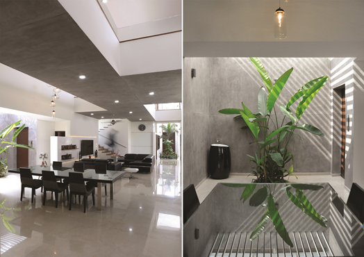
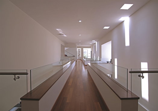
Internally, the
double-height ceiling is abutted vertically and horizontally by a raw-concrete
bridge that is the only indication of an existent first floor; adding an
element of intrigue.
The wooden-floored bridge
breaks the monotony of the otherwise seamless marble flooring, whilst bringing
in a touch of warmth. Use of timber ledges immediately evokes an Indian ethnic
sensibility and extensive use of glass for the banister lends transparency and
a visual lightness to the bridge - a moniker of studied acumen on the part of
co-principals Vindhya Guduru and Baba Sashank of Spacefiction Studio.
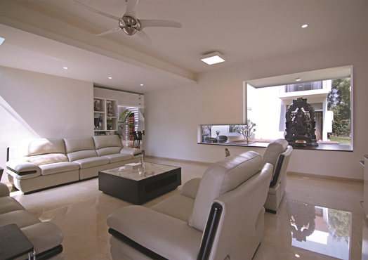
Astute spatial planning nurtures
spaciousness and is largely defined by absence of walls and partitions, where
only function and placement chisel out different zones.
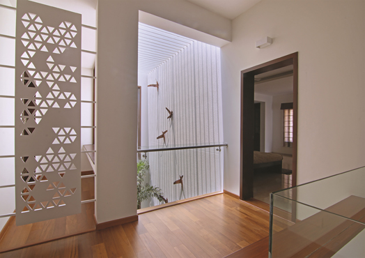
Heightening the overall
aesthetic are chiaroscuro elements such as skylights and pergolas, providing a
multiplicity of sensory experiences animating different spaces throughout the
day; seemingly air-borne hand-crafted metal birds mural; a pretty pink-petals
Plumeria tree and glass box flexi-spaces make it a minimal yet experiential,
modern yet ethnic home.


No comments :
Post a Comment