By Marina Correa
Photography: Courtesy the
architect
.jpg) |
| . |
A sprawling 6000
sq. ft. of inhabitable area and an expansive 3,000 sq ft terrace gets a ‘bungalow-like’ makeover at the hands of principal architect Sandeep J Shah of SSA Design Studio.
 |
| . |
.jpg) |
| . |
Accentuating the
positives viz., high ceilings and vast terrace and rising to the challenge of
transforming an old load-bearing chawl
layout into a bungalow, Sandeep began the exercise by equipping each bedroom with
an ensuite restroom, besides enhancing the master bedrooms with walk-in
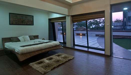
wardrobes. Maximizing on the view and the open terrace space, the guest
quarters and a well-appointed bar are positioned on the upper floor, while the
family bedrooms and living areas are relegated to the level below.
.jpg) |
| . |
The architect plays with juxtapositions veering from the traditional to the avant-garde as he
camouflages the many ‘I’ beams into the ceiling design, interestingly playing traditional
elements against a modern vocabulary. For instance, creating a spotlight, wooden
rafters are juxtaposed against glass on the ceiling along with an arresting
chandelier in the entrance lobby and dining area. A skeletal glass staircase
raises a toast to the two duplex levels and sliding folding partitions act as
space dividers and enhancers. In a similar vein, a softly landscaped terrace
flooring acts as a bold contrast against the old world charm of a Mangalore-tiled
sloping roof; exuding a distinct character.
.jpg) |
| . |
.jpg) |
| . |
A sumptuous
materiality defines spaces. Ubiquitous use of marble variations; elaborate
floor patterns; intricate jaali and
fenestrations on partitions and dividers; fancy terrace tiles inlaid with artificial
grass – bring about wholesomeness to the design and décor of this abode.
And peering at
the technicalities behind this tastefully attired abode, we see skylight and
sloping roof augmenting the structural and environmental vocabulary as do the
light-weight walls crafted out of Siporex and marble dividers instead of brick.
LED and plenty of natural light are complemented by solar power for the green
experience, all-in-all packing in a punch that gives the home an all-time
appeal.

.gif)
.jpg)
.jpg)
.gif)
Congratulations Sandeep and Anita
ReplyDeleteIt's always easy to be critical of a project from an arm chair. There are many factors and personalities that go into the final material and decorating selections. For me, Architecture is the form. It's level of harmony and grace sets the tone for what follows. A less than spectacular form is difficult to dress up- although it can be done very well. Great form can also be so covered up and hidden with incongruent material details- that the space is rendered much less than it's potential.
ReplyDeleteFor me, this project uses way too many different types of materials that do not support each other, (or work in harmony), much less bring out the best in them when put all together. Look to nature for inspiration. Look to the beauty of Indian art, architecture, and music for instance......they have a very developed, sophisticated esthetic. in response to IAnD's discussion thread, "Can the use of an extravagant material palette define an elegantly designed home?"
Very nice . Thank you for sharing .
ReplyDeleteThere is no harmony in this design. Using expensive materials does not automatically produce good design in response to IAnD's discussion thread, "Can the use of an extravagant material palette define an elegantly designed home?"
ReplyDeleteThere is no disharmony either . Beauty in the eyes if the beholder !!!!!!! Thank you .
ReplyDeleteBy the way . UTZON got similar comments for the opera house . The sail in Dubai is fabulous with no harmony as far as the interior is concerned . To me the architect has done a fabulous job .
ReplyDeleteIn the process of building a new house so I am on design blog overload at the moment but what I have decided that I want more than anything in my new house is - I want to love every single thing.
ReplyDelete