By Pari Syal
Photography: Harsh Sharma; courtesy the architects
Read Time: 2 mins
 |
| . |
Between Spaces Architects use a striking fabric-clad blue wall as the upping quotient in this duplex in Bangalore…
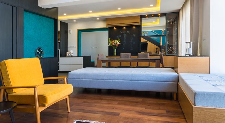
Working with a tight space despite the apartment being a duplex, the architects resort to curating a series of surprise elements in the design. Catering to the homeowner’s (a young urban couple) wish for a minimalist home and sans clutter, the design delivers with an added dash of timeless appeal and an efficiency that it derives from a controlled material and colour palette.
 |
| . |
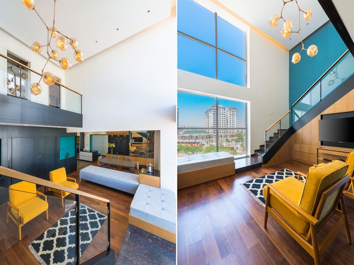
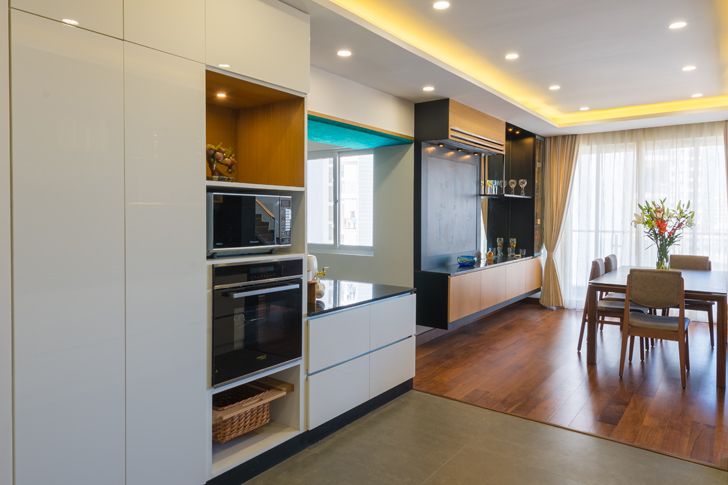
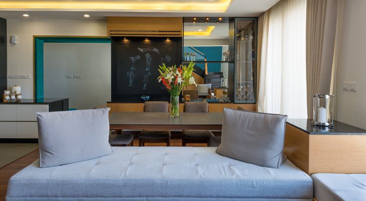
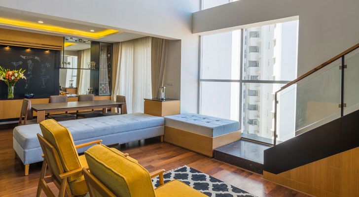
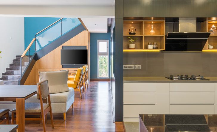
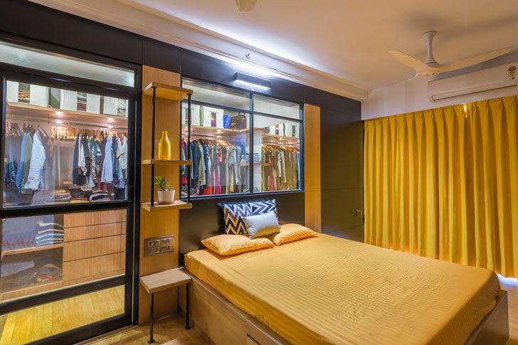
Design ingenuity dictates a layout that opens the already double-height living room to the city outside via a double-height glazing, allowing natural light to seep in. Strategic civil changes open the kitchen to flow seamlessly with the living-dining ensuring spaciousness. Conversely, the double-height foyer, which turned out to be a no-added-value proposition due to its tight space, is dwarfed to the normal height and a walk-in wardrobe created at the upper level using this space. Its wall is also pushed back towards the kitchen – just enough to make the foyer decently spacious.
 |
| . |
 |
| . |
 |
| . |
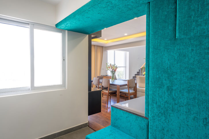
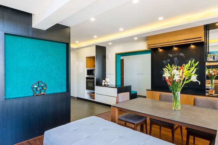
An unusual design element strikes as soon as one enters the apartment – a fabric-clad blue wall and ceiling jamb that camouflages the shoe cabinet and sustains its presence within as panelling as well as paint on the staircase wall. This striking teal blue sets the tone of eclectic chic and finds a perfect partner in black veneer, in turn, complemented by nuanced touches of light brown teak veneer.
 |
| . |
 |
| . |
 |
| . |
 |
| . |
While the gypsum false ceiling with cove lights connects the dining with the open kitchen, the engineered walnut wood flooring accentuates the expanse of the living and dining. Ingenuity prevails in smaller touches viz variation in the door sizes of the adjacent powder room and bedroom, as they stand camouflaged by the black veneer; or the glass partition that distinguishes the walk-in wardrobe from the master bedroom; the use of chalkboard paint, tinted glass, quartz countertops, and the refurbishing of the staircase railing that now sports a mild-steel paint-finished railing with toughened glass with Pinewood lining on top.
The home refreshingly comes alive in its minimalist palette –sans the predictable colourful soft furnishings -chic in its imaginative, subdued approach - the perfect canvas that delights as it awaits evolution.
Fact File:
Client: Pooja Vijaywargiya and Anshul Singh
Design Firm: Between Spaces
Principal Designers/Architects: Pramod Jaiswal (Principal) Sushma Prabhu (project architect)
Built-up Area of Pproject: 1800 sq. ft
Carpet Area of Project: 1400 sq. ft
Location: Boganahalli, Bangalore


No comments :
Post a Comment