By Marina Correa
Photography: Anand
Diwadkar; courtesy the firm
Read Time: 2 mins
Cluster One
Creative Solutions’ most recent home interiors displays a candid, balanced and
pragmatic approach strengthened by its surface-bound articulations...
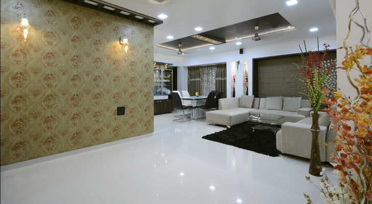
An all-white
shell with neutral tones of umber and grey speckled with a few pops of primary
colours forms the base of this approx. 1500 sq.ft Pune residence. Seemingly
simple at first glance, the home is fostered by a spacious feel augmented by
large windows that bathe the interiors in natural light. Ably complemented by asymmetry
in furniture and a partially open-plan layout, it is the details that make the
difference.
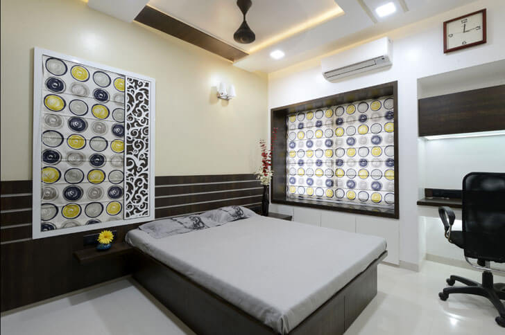
Juxtaposition of
different tones of browns and greys dot the area rug near the sofa, ceiling,
blinds in the bedroom and the like, standing out against the ubiquitous white
vitrified flooring, offsetting the pristine background and infusing the home
with a warm and welcoming vibe.
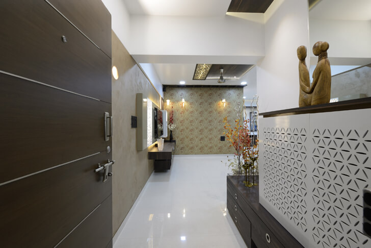
Playing on a tried
and tested colour palette, a harmonious balance is maintained throughout the schematic.
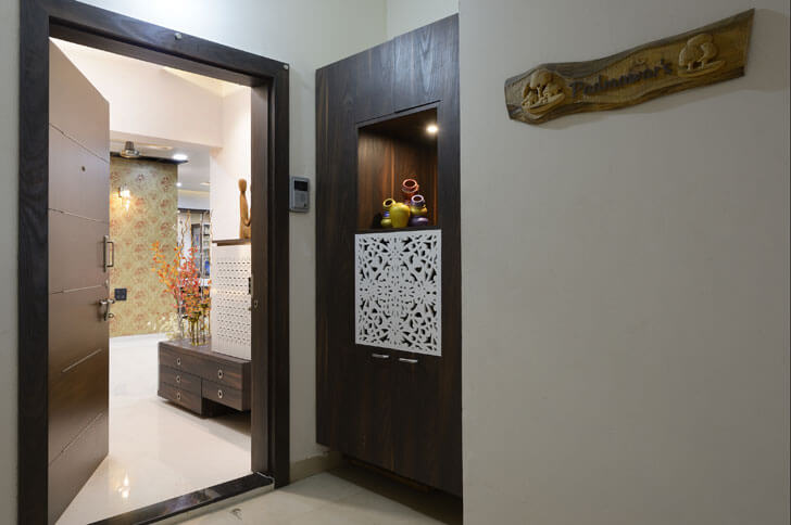
Be it in the colour quotient such as a sponge-finish/faux finish on the wall
along the entrance or as seen in the delicate juxtaposition of lattice screen,
niche and solid-volume storage unit just outside the main door.
The architects
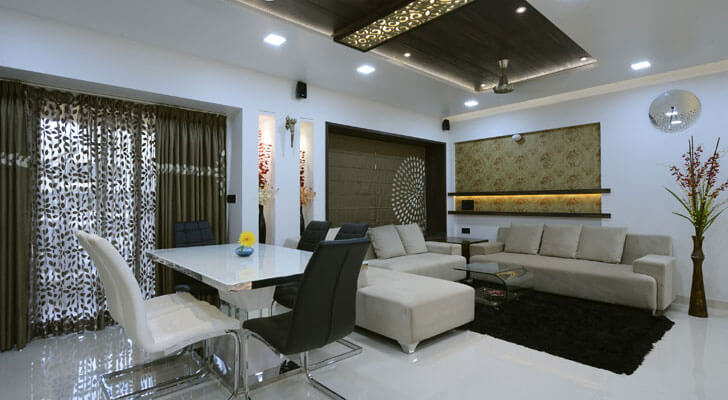
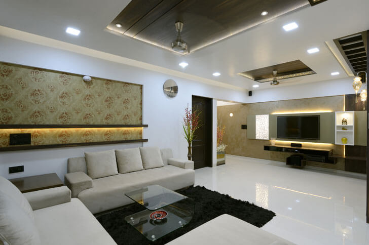
strategically use motif wallpaper for the living room backdrop wall, where they
ingeniously add inverted pelmets and cove lighting to infuse interest – instead
of a regular painting on the wall!
 |
| . |
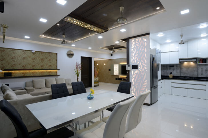
In fact, they diligently
break the otherwise solid palette via back-lit laser-cut screens that
camouflage storage or act as partition or as a balancing element, where one
side of the TV has niches, while the other has a cut-out panel.
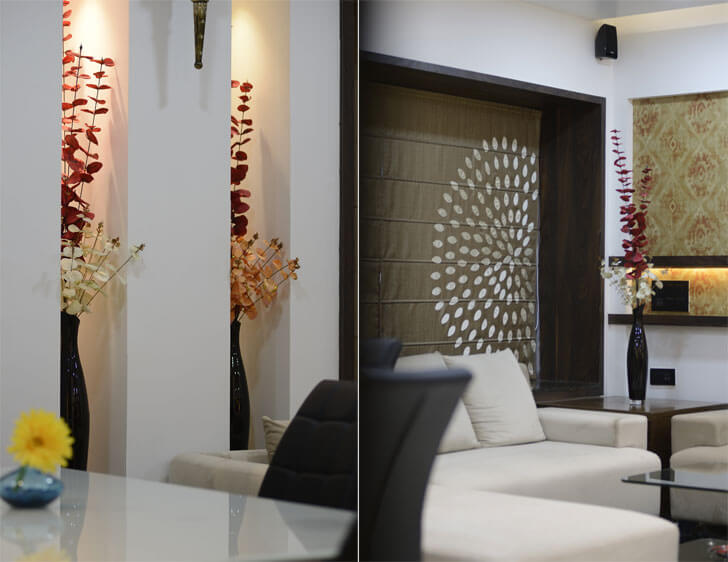
Add to this the
final touch of niche, cove and spot lighting that creates different moods,
whilst laser-cut decorative panels add a traditional touch to the otherwise contemporary
interior.

Very good interiors. Architect has implemented very creative ideas on design and layout of furniture.
ReplyDelete