By Rutvi Ashar
Photography: Stepan Novotny; courtesy the architects
Read Time: 2 mins
At the newest Little Italy in Pune, Ar. Aijaz Hakim of Studio AHA ingeniously twists pragmatism into flamboyance working with a mono palette and simplistic POA...
A project that has been shortlisted for Bar and Restaurant Awards 2015-2016 is bound to be something special! Designed by Aijaz Hakim Architect, this 4520 sq. ft. restaurant welcomes you into an ambience that is both, practical and chic.
 |
| . |
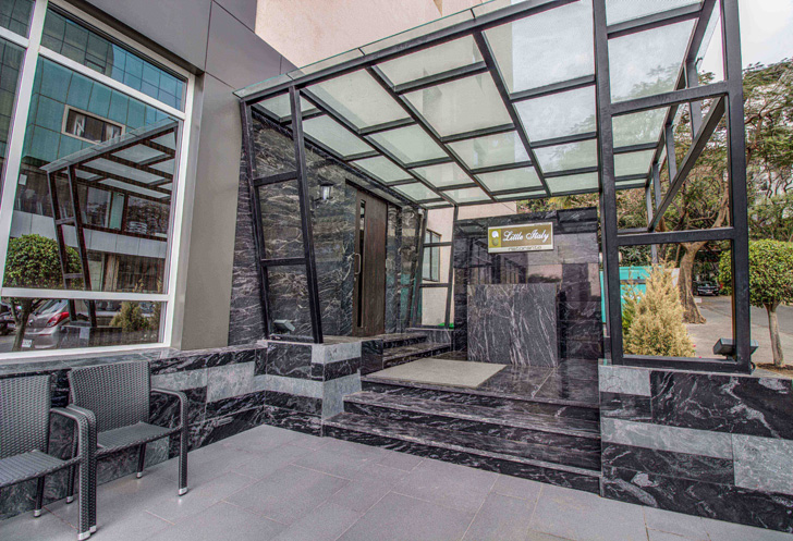
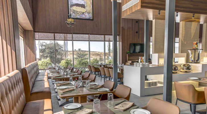
An imposing large glass overhang that seems to be a continuation of the grainy black granite flooring and cladding greets you, ushering you into the warm interior, where the granite, although used extensively, takes a back seat to a vocabulary in wood – fluted, textured, smooth and rich in character.
 |
| . |
 |
| . |
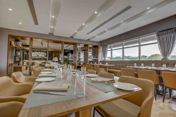
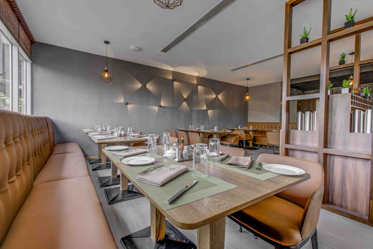
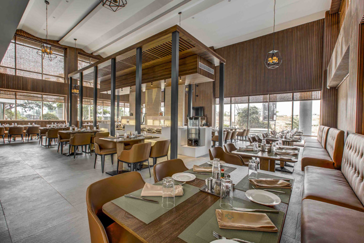
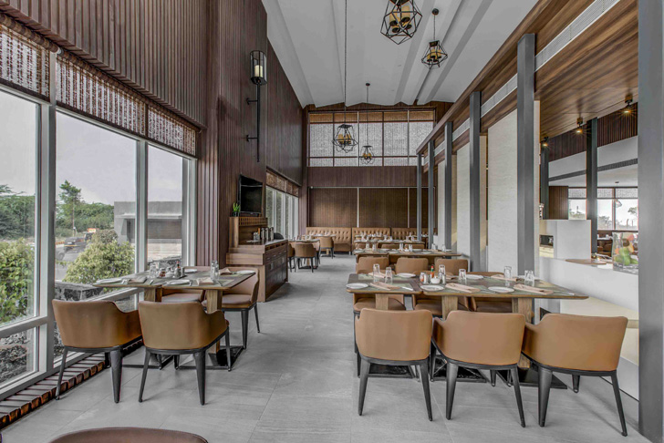
The exteriors and interiors are made one by the use of large floor-to-ceiling openings bringing in, with the green landscape, a gorgeous view of the surroundings. The interiors are naturally lit during the day; the open restaurant partitioned by contemporary wooden screens and granite-clad structural members, facilitating family dining. Harmony between the rustic and refined allows the restaurant to cater to a larger audience with different tastes.
 |
| . |
 |
| . |
 |
| . |
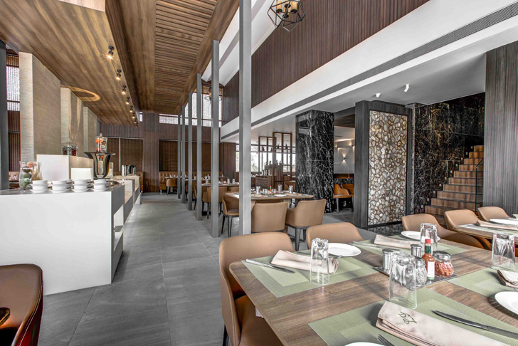
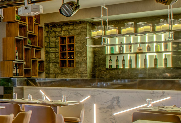
The functional aspects become the highlights on each floor - centrepiece buffet station on the ground level and a DJ console/bar on the upper level. Owing to the large 6m height available on the ground level, the buffet station is sheltered by a modern wooden canopy that draws the eye vertically enabling diners to appreciate the undulating ceiling with cove lighting and the pendant lights, a signature of the designer. On the other hand, the DJ-counter-cum-gold-granite-bar located at the very end of the upper level acts as a platform, allowing the bartender to show off some tricks!
 |
| . |
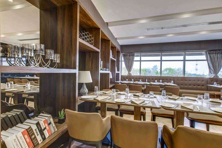
Sustaining the open-plan layout, an interesting screen is crafted out to act as a shelving system-cum-partition; the pattern finding its complement in the boxed-arrangement at the bar.
 |
| . |
Going by the colour palette and the subtly layered design, this Italian fine dine will remind you of the classic Tiramisu; as you sit back and allow the coffee-coloured interiors to seep in!

Nice Collection's of flooring design.I am really impressed with your writing skills as well as with the layout on your blog. Anyway keep up the nice quality writing, it is rare to see a great blog like this one today.
ReplyDelete