By Marina Correa
Photography: Chandra Shekhar Mandge; courtesy
the firm
Principal designer Manish
Kumat of Abhikalpan Architects introduces quirky, asymmetrical and offbeat design
elements, adding a refreshing take to this sprawling 8,000+ sq. ft., three-level
bungalow in Indore…
Veering away from the
regular and oft-repeated elements in home design and décor, the designer
ingeniously works on a corroboration of tried-and-tested design and an
emotional response.
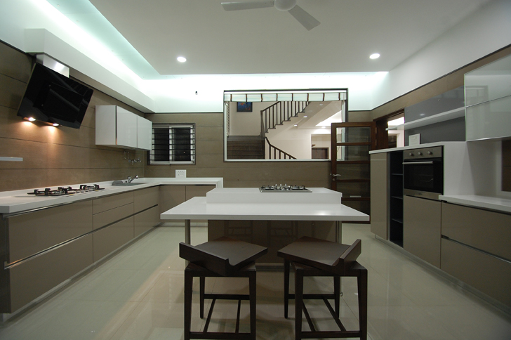
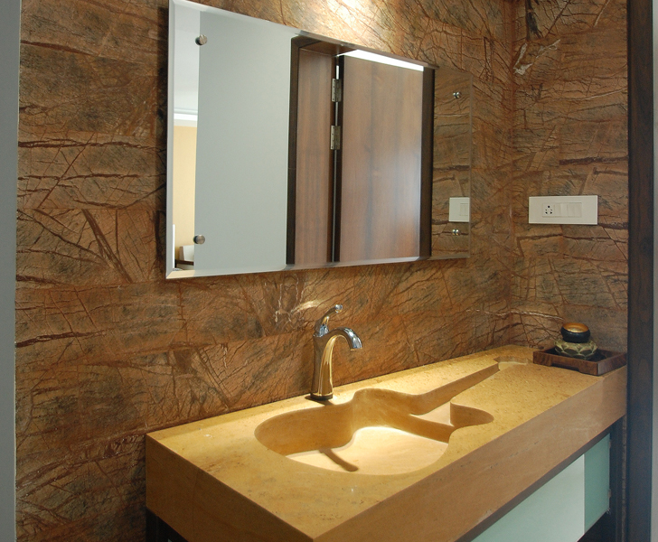
Tiny nuances such as swivelling
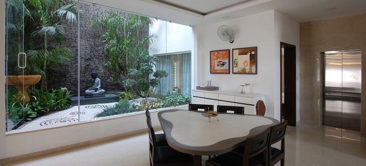
chair seats; bevelled glass window in kitchen; stone wash basin flanking the
dining area; quirky console legs; triangular dining table; guitar-shaped sink etc.
not only command intrigue but work on the subconscious level to connect with
the client and leave their mark.
In the living-dining area
on the ground floor, wooden ceiling strips accentuate linearity and a floating
false ceiling follows the line of depth of the dining table.
 |
| . |
Wooden accents throughout
the home confer a timeless aura whilst the plush and the classic are blended
well. For instance, even though the jacuzzi-cum-spa area is completely clad in
grey marble monotones, a gentle touch of wood used as the rim of the jacuzzi
and clothes rack instantly brings elegance and warmth.
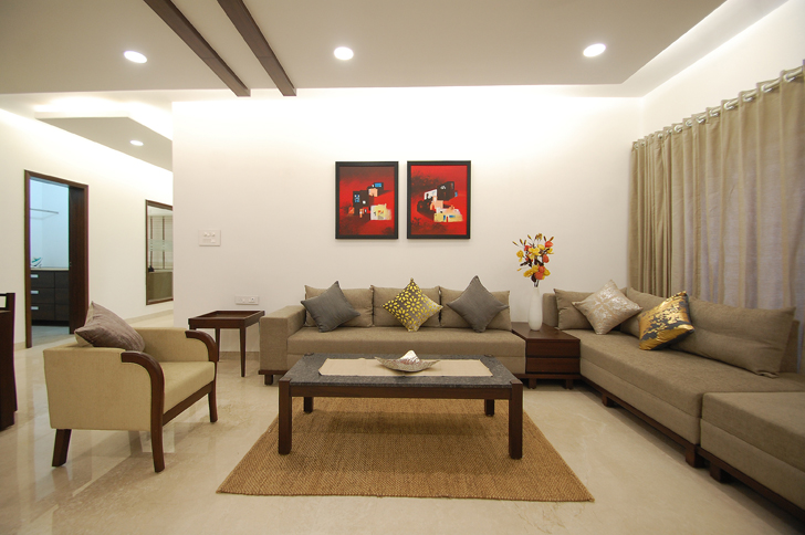
The home revels in an uncluttered
feel as the colour and material palette is sober and subtle whilst the furniture
is well spaced out – alluding to an air of restraint and understated style.
Colour is introduced viz. paintings, cushions and occasional wall cladding.
Designed and built for a
joint family, the house features a simple plan with clean and straight lines and
a doubling of certain functions such as living-dining, kitchen etc. thus
allowing for shared social interactions (in common areas like deck, home
theatre, lounge etc) as well as imparting privacy to all members. Providing an external
staircase helps to further this principle.
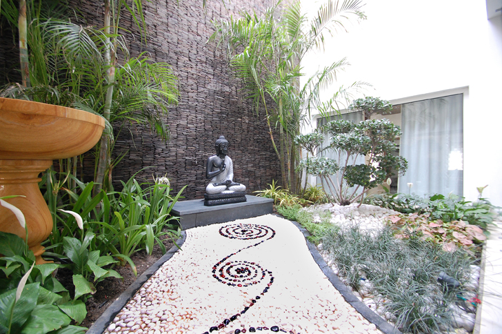
Terrace gardens, sit-outs,
decks and a well-appointed, open-to-sky courtyard brings a flood of natural
light and ventilation whilst connecting the home to natural greenery on
multiple levels.
 |
| . |
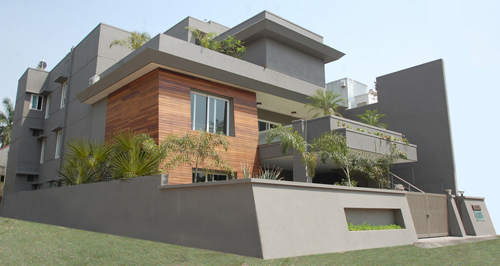
Not to be left behind is a
play of voids and masses, soft use of African wood and a dark grey coloured
tapering perimeter that lends a powerful yet gentle touch to the façade.




one of your better posts.
ReplyDeleteamazing bro..the best interior i have ever seen
ReplyDelete