By Savitha Hira
Photography: Courtesy
Studio ABD
 |
| . |
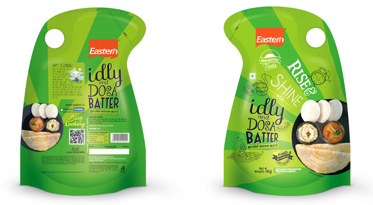
The new
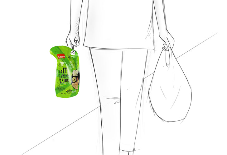
Idly-Dosa Batter pack from Eastern Condiments Pvt. Ltd adopts a trendy, breezy
graphic style that makes its way right into the hands of its trusted fan
following...
The launch of a
new product in the marketplace is governed by multiple and layered parameters
that speak for its success or failure – right from the word go! An established
brand like Eastern in the culinary segment is a proven. Yet, to draw people to
its new addition – Idly and Dosa batter – the company rises above its competition
with a go-to design, conceptualised and executed by award-winning
Bangalore-based Studio ABD Design Services Pvt. Ltd.
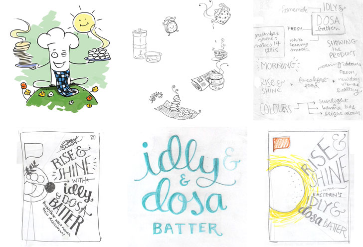
The
communication storyboard of the batter with its tagline - Rise & Shine -
follows the predictable start of all that mornings entail – sunshine, newspaper,
alarm clocks ticking off, hot beverages, warm breakfast and general urgency. Ushering
in cheer and brilliance, this everyday humdrum is transformed into an edgy,
out-of box approach that works on a chalkboard graphic style or font-collage, if one may call it
that!
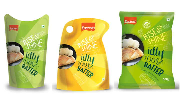 |
| Structural Explorations |
Multiple
typefaces - 'Sofia',
'LSTK Bembo', 'Janda Quirkygirl' and 'Wish I Were Taller' and hand-made types occupy
an average area of 4-16% of the standard 1kg pack - comfortable on the eye and
striking enough for the active brain to pick up the play and inherently
symbolic spontaneity.
Ergonomic
in form, the stand-up pouch (first in this segment of ready-to-cook)
conveniences shelf display in the store – bound to grab eyeballs – as well as
fits in conveniently in the refrigerator door – to be picked up at ease! The colour green associated with freshness is
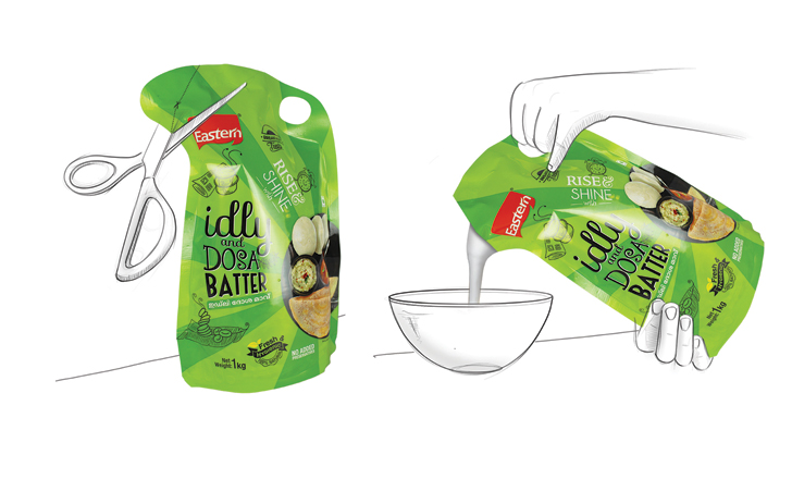
visually striking and the circular cutout towards the top edge facilitates in
handling and pouring.
The studio tells
us that the alternate language – Malayalam font – is included as the product was
launched in Cochin. As for the
environmental impact in its disposal – the polyester-poly
dual layer film that coats the pouch can be cleaned and the pouch discarded as
dry waste – only then making it
recyclable. However, this may be a limiting factor for a busy housewife, as
whether she cleans the pouch prior to disposal is an odd the company is playing
on.
Following the
same visual architecture, Eastern is now working on expanding its breakfast
range with more delicacies.
IAnD conducted a spot-on review of the packaging
with a closed group of 40 women – a mix of working and homemakers – and capped
it with the opinion of an expert! Here goes...
- Smart looking pack! Makes you want to pick it up and try it out.
- Generally Eastern masalas are good. So the users of E will definitely try it out.
- The packing is definitely attractive
- Nice package… is that an idly-shaped hole to make it easy to carry?
- The hole is a neat idea…the packaging looks attractive
- Is that the sun rising in the east? So it goes with Eastern?
- Natural curvature will give a free flow of batter. Seems like self-lock system is there if you cut only along line indicated.
- Colour is that of the banana leaf with sun ray strokes indicating traditional breakfast
- Idli- dosa font looks like round idlies. Local language entry into Kerala market?
- It’s the best packaging of batters so far…
- Kerala breakfast is puttu and appam, no? Subtly teaching them to make good idli dosa?
- Is it really important? Eastern brand should be enough…
In
the words of Art Director of Graphic Communication Concepts and veteran graphic
designer Sudarshan Dheer, “In design field, there are no hard and fast rules. Typography, in itself is a medium of
expression to create certain feelings and ambiance. The designer has
successfully created an atmosphere of celebration and convenience in
a lighter manner, and has dealt with the objectivity brilliantly.”
We invite you to leave us your comments in the box below.


No comments :
Post a Comment