By Sonal Mamoowala
Photography: Amit
Rastogi; courtesy the architect
This elegant
contemporary styled home stands cheek by jowl amidst bungalows in a densely
populated north-eastern Bangalore suburb, dictated by an east/west axial introverted
design…
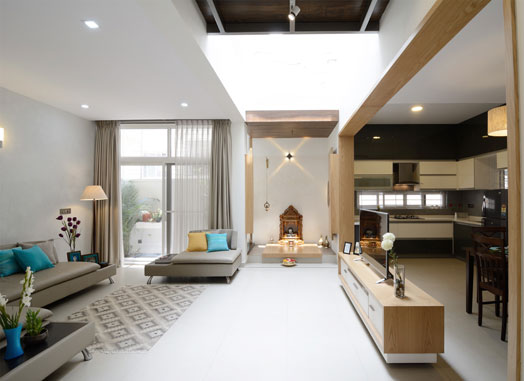
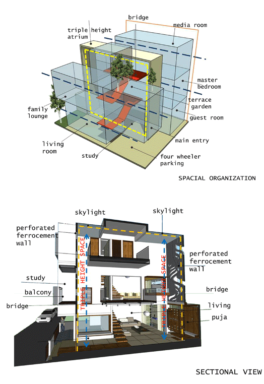
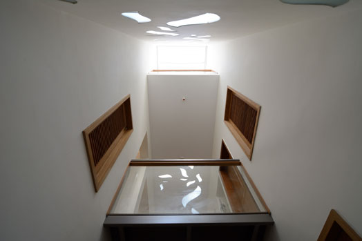
With the home designed
as two blocks conjoined by a central triple height atrium core, Ar. Shireesh Madalagi of ARO
Design Studio creates interest in the unhindered, seamless yet well demarcated spaces
via split levels and bridges to facilitate easy interaction, whilst maintaining
the requisite privacy for the 3 generations residing here.
 |
| . |
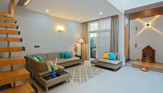
Linear placement
of pragmatic straight-lined modern furniture in muted tones of beige and ivory,
and light coloured veneers and paint, often used as defining elements, give the
uncluttered home an illusionary feeling of spaciousness. An open plan layout
and extensive use of glass augment the spacious feel, and provide a visual link
to the interior spaces.
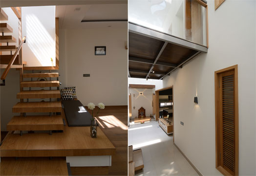
Abundant natural
light permeates through external glazed window openings, internal wood framed slats
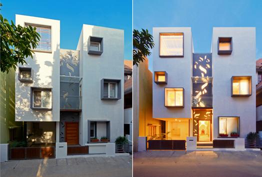
and skylights. Breaking away from this strict geometry are two Ferro-cement
walls that also constitute the simple but striking façade - with abstract cut-outs
of soft forms creating interesting chiaroscuro patterns with the shifting
sunlight. At dusk, warm artificial light inside lends to an interesting picturesque
exterior façade.
A corner
courtyard provides relief to the ground floor common space, while the uppermost
level is a virtual garden, with the media room surrounded by pocket terraces
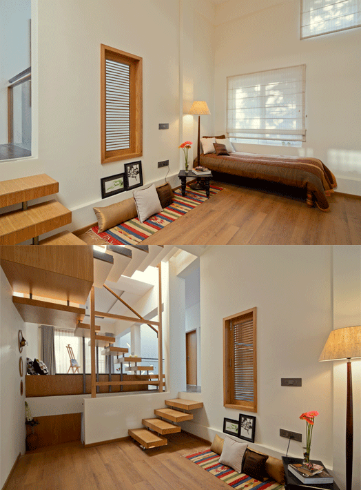
with cozy seating. Sandwiched in between at mid level are the bedrooms,
sparingly furnished in muted tones, wooden flooring and a dash of coloured
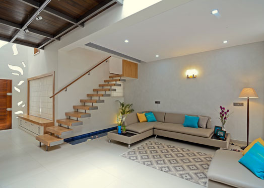
accessories. Vertical movement is facilitated
by a sleek cantilevered metal-edged, wood-finished staircase, below which
nestles a linear water body, flaunting yet another dimension of this serene
abode.
 |
| . |
One wonders
whether some colourful art could add a zing to the serenity; but then, that
would alter the synergies of this architecturally rich vocabulary that is a
statement in itself, with its understated demeanour!


Corner courtyard,really interesting.It gave more space to room.I definitely enjoying every little bit of it. It is a great website and nice share.
ReplyDeleteWonderful superb awesome fantastic mind-blowing what not :))
ReplyDelete