Compiled by Team IAnD
Photography: André J
Fanthome & Ayush Prakash; Courtesy Anagram Architects
 |
| . |
Anagram
Architects design Pioneer Outdoor Media office, projecting an arresting visual
language and the split-second impact of a roadside billboard, while simultaneously
committing a deeper value and meaning to the organisation, the edifice and the
occupants.
One
is often struck by an intriguing three-dimensional billboard and one ponders
over the evolution of outdoor or out-of-home (OOH) media and advertising over
the years. A strong mass-connect; outdoor media propounds a vocabulary that
rises from and gives back to the urbanscape via an instantaneous and impactful
connect. Therefore, designing an office that would showcase the dynamism of the
profession is a challenge that Anagram Architects have accomplished with
aplomb!
The
15000 sq. ft. office that stands on a linear plot in a row of narrow urban
plots with limited street frontage, in a neighbourhood of predictable
inward-looking buildings with drab rectangular-block facades has been
transformed into a signature element – for the company as well as for the
locality.
“The
approach of our design was to investigate the notion of identity (corporate,
organisational and individual) and its urban projection,” inform the
architects. “And to this end, we explored, semiotically, the most common idiom
of identity, the thumbprint.”
.jpg) |
| . |
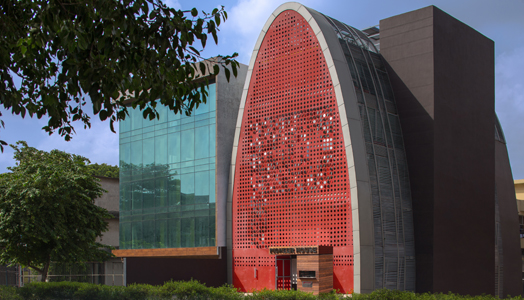
Comprehending the finer nuances of the profession, the architects have translated its ethos into a design vocabulary that is at once contextual as it is upbeat. Referencing the projected profile of the thumb, the frontage of the building sports a singular formal articulation via a deep red aluminium perforated screen that mitigates both, noise levels from the street as well as solar heat gain.
.jpg) |
| . |
.jpg) |
| . |
Perforated
with the company's logo “P”, the stamped-out discs are reattached to the screen
through a pivot detail and not only create a dynamic visual element outside,
but contribute to an equally energetic interior environment; the red perforated
vocabulary continuing into the partitions between the main circulation spine
and the workstations in the office.
Also, once inside, the continuity of the representational thematic finds
a complement in the thumbprint ceiling of the entrance lobby, subtly alluding
to the corporate identity and brand projection.
.jpg) |
| . |
Speaking
about the form of the building and its role in spatial organisation, the
architects inform us that the semi-elliptical cylindrical volume creates linear
voids that stretch along the length of the building, infusing the workspaces
with natural light diffused through a skin of louvres. Planters
project into these voids along the edge of the floor plates investing greenery
into every nook of the office.
.jpg) |
| . |
The
company's corporate structure is also implied in the volume with the
hierarchical levels of the work force and management segregated into various
floors of ascending seniority and reducing occupancy.
The
building comes across as a happening volume of activity, acting as a precedent
to employee motivation right from its very sighting to its entrance lobby… to
the job at hand!

.jpg)
.jpg)
Once a great idea has already been transformed into a business start up, the next logical step is to introduce this idea/brand to the rest of the world, particularly to the sector of the population that will benefit the most from the products or services being offered.
ReplyDelete