By Anuradha K.
R.
Photography:
Courtesy Studio US
.jpg) |
| . |
Monotony
and complexity have no room in Italian cuisine and so it is, with the design of
this restaurant in New Delhi that serves it. The design team of Sumeet Nath and
Aanchal Chaudhary has tastefully carved out a setting for Ristorante Prego that
essentially blends variety with simplicity.
Set
inside a busy shopping complex, the 1800 sq. ft. restaurant has enough room for
zoning. The restaurant’s placement on ground floor draws street shoppers to its
casual dining section, while its mezzanine floor provides for a fine dine
experience, removed from the hustle-bustle. Ground floor has zoning too, with a
quick standing bar and a patisserie for those in hurry and a couch dining
facility for those who aren’t.
.jpg) |
| . |
The
exteriors of the restaurant and a few pockets of its interiors are encased in
rustic yellow fire bricks that dispense the charm of a neighbourhood walk-in
bistro. The contours of the mezzanine floor that overlook the lower zones present
the imagery of typical Italian balconies that open out over streets; while double
height wall brings in an element of openness to the entire space and the 18ft
high wine-rack placed against it, evokes a sense of awe!
.jpg) |
| . |
.jpg) |
| . |
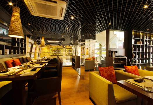
The
colour brown and its varying hues is all pervading: the aprons of the bar, patisserie
counter and table-tops sport varied hues of brown, while the upholstery and
chairs are in solid chocolate brown. Upholstery in the fine-dine section is in a
lighter shade of the colour, in sync with the ‘golden’ gleam emanating from painted
walls and wallpapers.
The
ceiling with its open-grid pattern in black, Italian Myra flooring in beige,
cage-like wooden partitions in off-white and jute hanging lamps are the ‘common threads’ that run across the diverse zones of the
restaurant, imparting unity to its being. The wooden cage, rising to 8ft from
the ground is the element that stands out, lending a unique aura to the ambience.
.jpg) |
| . |
.jpg) |
| . |
Bright
cushions and optimally-lit display counters with neatly laid out earthy
artefacts & books add a touch of class to its interiors.

.jpg)

I am happy to find your distinguished way of writing the post. Now you make it easy for me to understand and implement the concept. Thank you for the post.
ReplyDelete