By Zoya
Photography:
Jeetin Sharma; courtesy Architecture Discipline
.gif) |
| . |
Indigenous design elements and allegory through multiple architectural
elements pays homage to Indian fashion in the 2200 sq. ft. multi-designer
Neel Sutra, lending it a unique identity amidst a spattering of global
hi-design brands in a five-star hotel in Gurgaon.
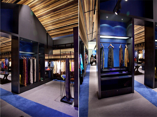
Envisioned as an “austere house of Indian fashion”, the store design employs
a hut as a fundamental notion of shelter, for which 11 shades of Indian timbers
are used: Padauk, Neem, Babool, Rosewood, Teak, Sheesham, Deodar, Spruce,
Mango, Hollock and Eucalyptus. These with their “serious sustainable
connotation” perfectly fit the allegorical theme of the store, with layered
references to Indian textiles – their weave, material play and textural
nuances.
.jpg) |
| . |
The single-line hut typology
sports a pitched high ceiling that immediately lends depth, emphasizing on linearity,
generating scale that urges one to look up towards the pitched roof. The timber,
for visual texture and finish, has been hand-rubbed with Neem oil - a long forgotten
traditional crafts practice.
 |
| . |
.jpg) |
| . |
A rugged industrial set up flaunting technical details of joinery complements the timber envelope. Built-in merchandise racks and shelves clad in distressed zinc mimic a hut with windows, while the floor anointed with a touch of deep royal blue, flags off the display, drawing away from the contemporary rusticness of the ambience. Tall and varying in dimension, the metallic stands that hold the roof together, add a sense of scale and order through dissonance. All design elements intended as backdrop, are rendered black using blackboard paint and polished in kohl for a matte black finish.
.jpg) |
| . |
With the display relegated to the periphery and some convenient table-top arrangements, the store offers ample space to browse, ponder and debate. Lighting via simple spotlights is flexible and accentuates the design elements besides highlighting the merchandise.
.gif) |
| . |
A major challenge that Akshat Bhatt, Principal Architect of Architecture Discipline, who has conceptualized and designed the store, faced was the low ceiling height in front of the store. To overcome the same, a large opaque zinc door is installed off-centre to mark the entrance, the mysteriousness of which announces the store to even casual observers. Clear glass scales the façade of the store and a threadwork installation (sutra) in shades of blue (neel) and orange references the branding.
.jpg) |
| . |
The three basic ideas behind the hand-crafted design approach of the store - create its presence, play of spatial volume and a resilient identity - stand successfully accomplished.

I think this the first fashion store with wooden interior. Really awesome interior and concept.
ReplyDelete