By
Namita Nathani
Photography:
Sebastian Zachariah;
courtesy the architect
 |
| . |
Using
colour as a binding factor, Mumbai architect Kunal Barve harmonizes vintage
aspects with contemporary decor to carve out a synthesis of old and new
thought...
Refurbishing
is one story; but refurbishing with diktats that match a passion for antiquity
and modern and within set parameters of the Vaastu Shilpi philosophy of
building design is altogether another story.
.jpg) |
| . |
The residence in suburban Mumbai designed by
Ar. Kunal Barve of Interface is an exercise in refurbishing that the client
engaged in after a gap of twenty years. The gap also extended to the
generation, where the elder folk aspired for vintage and the younger for avant
garde.
.jpg) |
| . |
Bridging
relationships between people, objects, spaces and places, the home is designed as
an eclectic mix of design elements and succeeds at oozing warmth via play of
form, texture, pattern and colour.
.jpg) |
| . |
.jpg) |
| . |
One
sees a combination of straight lines, clean and chic flirting with soft
contours, introduced in some pieces of furniture, in lampshade patterns or
jali-designs of partitions etc.
.jpg) |
| . |
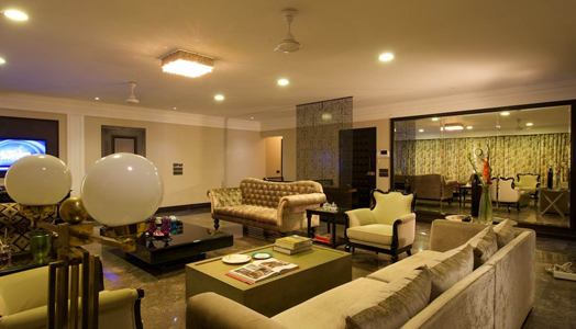
The selection of furniture in the spacious living
area too seems disparate at first glance. However, it is a studied mix of contemporary
furniture juxtaposed with that sporting a Georgian touch, like a chaise lounge
juxtaposed with two differently styled sofas, the composition peppered with
modern tables; and the combination tied together with a monochrome colour palette.
A similar vocabulary follows through the rest of the home.
.jpg) |
| . |
Details
add a charming personal touch viz., the large delicate laser-cut screen that
hints at a lobby entrance; an ornate hammered mirror in metal; centre table in
black mirrors; art deco light fittings,
matte metallic sliding doors, oversized sage fern wallpapers and the like that
foster a sophisticated ambiance.
.gif) |
| . |
While a discerning use of colour binds such disparity in form and style, at places, the literal juxtaposition of classic and contemporary, though subtle, seems repetitive. Maybe a breaking away from a stereotype in every frame could have taken the compositions to a newer level within the framework. But there can be several maybe's. Overall, it is a commendable
exercise in residential design, given the challenging client brief.

Nice!
ReplyDeletei love the perforated panels!
ReplyDeletethanks
DeleteGood Interior home panels
ReplyDeleteHer interior model nice nice..
ReplyDeleteOke thank you pack the info is very helpful for us, success is always...
ReplyDelete