By Smita Singh
Photography:
Courtesy the architects
Noida-based Archohm
Architects play illusionists and transform a small office with focus on 3
fundamentals – space, light and sound...
Challenged to accommodate an 8-people conference room; workstations, a waiting area, pantry, guest toilet; director’s room with attached restroom and storage space in 450sqft of space, the architect firm led by principal architect Sourabh Gupta, have designed around a camouflage principle with an intriguing play of simple elements like overhead planters, glass walls, mirrors, etc.
Clad in white - a colour that
opens up the space, the compact office houses pragmatic functions like pantry,
fax machine, etc into a customised corian unit, and organizes storage via
closed and open compartmentalized niches.
Treatment to the furniture is laudable: the centrally positioned workstations are in fact, a single continuous unit in corian designed for 3 people, with a side bench for visitors. Cork/ tag board partitions divide the workstation table top, doubling up as pin-up boards. Overhead planters visually divide the areas into waiting and working.
The all-white
materiality is interestingly broken, when one enters the chic conference room
and director’s cabin. The company’s product line – leather shoes, are displayed
in leather-clad punctures along a quilted leather wall, complemented by a brown
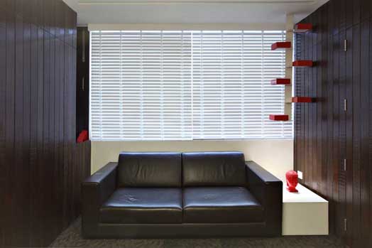
carpeted floor. Along similar lines, the director’s cabin sports shades of
brown in the carpet tiles, leather sofas, rough and smooth polished dark wood,
which makes it an impressive space.
Light, as the second
predominant element is catered to via a striking Barasol
fabric pendant, general artificial light as well as a
balance of natural light; contributing refreshingly to the ambiance of the
compact work place.
Sound absorption is
taken care of via choice of insulating materials, right from the entrance door
to the double-glass screen, quilted backdrops and carpeted flooring.
The project stands testimony
to the inherent challenges of, and illustrates the phenomenal design and
expression of thought-provoking interior design, within constrained spaces.

.jpg)
.jpg)
.jpg)
.jpg)

.jpg)
.jpg)
I appreciate the basis of this idea. However, I notice perhaps a rhetorical strategy present. Keeping the fundamentals down to a single digit number reinforces the guise of a seemingly simple area with disturbingly complex technology that has potential for mis-interpretation and mis-use, compromising the integrity and intention of its design.
ReplyDelete