Compiled by Savitha Hira
Photography: Suryan & Dang
Read Time: 2 mins
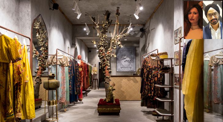 |
| Torani Flagship store (inset) Designers Navneet Kaur & Udaai Batra |
Designers at Bora Da’ Designs perpetuate a shift in modern, conventional retail design as the Torani garments store in Delhi follows the architectural language of Sindh…
Led by a unique client brief that did not seek the luxe and gloss of modern store design; instead, aspired for Sindhi Architecture in resonance with their products, designers Udaai Batra and Navneet Kaur weave old-world minimalism into a chic ambience that spells homely warmth for its customers.
 |
| . |
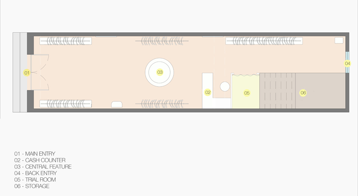
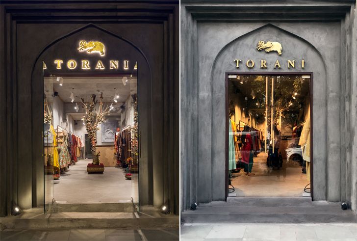
Torani is one of the first stores located near the entrance of the posh Khan Market in Central Delhi. Surprisingly unhampered by neighbouring storefronts, a footpath leads one to the main entrance of the store, while a secondary entrance at the far end of its rectilinear layout draws customers from the internal walkway.
 |
| . |
Starting out with a thematic that spells the strong doctrine of Sufism and borrowing from Persian architecture – both considerably rampant influences seen in Sindhi architecture of yore – the design language draws from 16th century medieval times in the province of Sindh, Pakistan to celebrate raw minimalism.
 |
| . |
 |
| . |
 |
| . |
 |
| . |
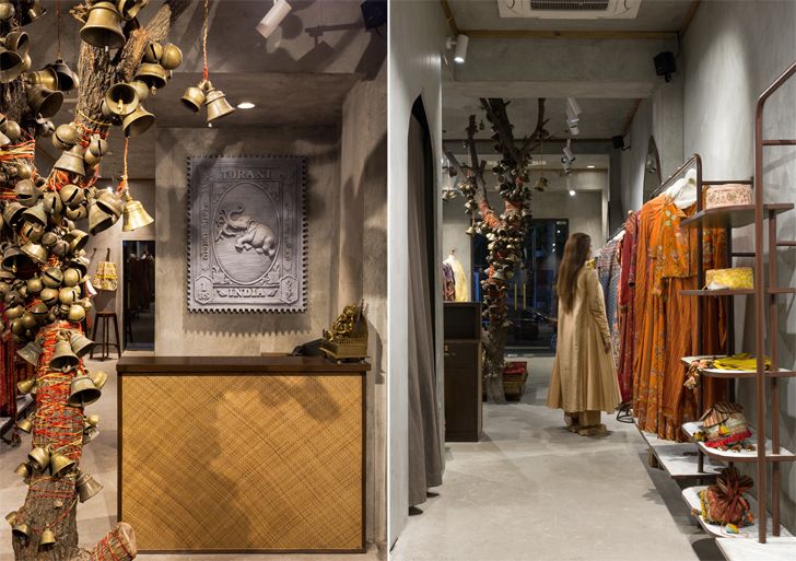
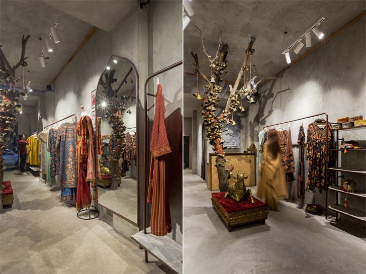
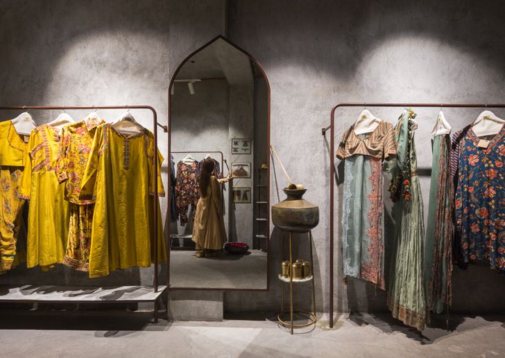
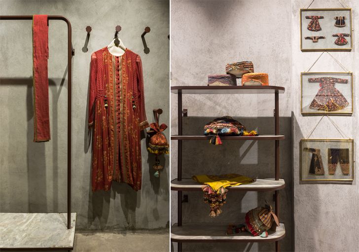
The whole store resonates the idea of simple clean design with earthy colours and raw materiality, the drama called upon by the clothes. With the walls playing an expansive canvas for the earthy and grainy textured grey paint that covers every inch - up and down over the beams and ceiling to bind the store in a monochrome envelope, the rugged feel, bare metal display stands, clothes pegs monogrammed with the Torani logo, looking mirrors set inside arch-shaped frames, hints of brushed brass accessories typical of Sindhi culture…
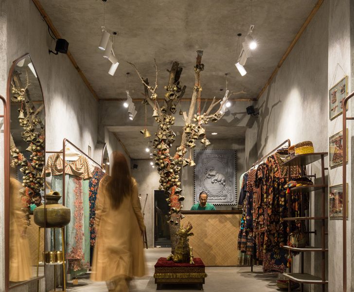
The flooring, however, ceases to match and flow with the walls, its grey micro topping enhancing the aura of antiquity and minimalism - further augmented by the 14ft. high ceiling that adds verticality to the 400 sq. ft. space, making it appear roomy and open.
 |
| . |
The showstopper comes guised as a centrally placed bare tree trunk from which are hung brass bells of various styles. Each bell is suspended using saffron threads (compelling cultural element) that also spiral around the tree to remind one of the rituals that are deeply rooted in the Indian culture. This central attraction is the first thing one sees when one approaches the face of the store.
The design combats the inherent challenges of an engaging display in a narrow spatial distribution; approx. six-inch thick shared walls with neighbouring stores that could not be perforated; and the ultimate challenge, which was to execute the project within a fortnight, given the economics involved.
Fact File:
Client: Karan Torani
Typology: Retail
Design Firm: Bora Da’ Designs
Principal Designers: Udaai Batra & Navneet Kaur
Design Team: Udaai Batra, Navneet Kaur, Mohommad Faisal, Ritu Kumar
Built-up Area: 400 sq. ft.
Carpet Area: 400 sq. ft.
Location: Khan Market, New Delhi

Thanks for the feature ��
ReplyDelete