Ideas for a bright & beautiful home!
Pre-Diwali Special 2019
By Team IAnD
Photography: Courtesy World Wide Web; IAnD archives
Read Time: 1 min 30 secs
 |
| . |
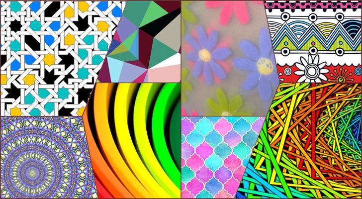
Do you often wonder how some décors flaunt a plethora of patterns with aplomb?! The ‘prints and patterns’ or the ‘mixed patterns’ trend has made arresting decor vistas since ages. IAnD decodes the trend for you…
Of late you must have noticed how you don’t really need to worry about what you wear if you wear it with dollops of confidence and endorse your individualistic style. A notable trend is the pairing of heavy prints and the unlikeliest of colours - that was once considered a fashion faux-pas.
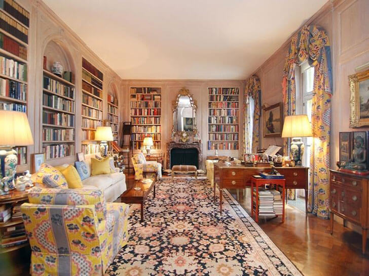 |
| photo-credit: albert hadley |
Like the many fashion trends that often spill into our interiors, the prints-and-patterns trend too has found its way into dressing our spaces. In a way, this effortless mix of patterns and colours is a revival of a very distinct style propagated in the late 1980s through the early 1990s by the late Albert Hadley, a preeminent American interior designer best known for his eclectic premeditated style of design.
Team IAnD picks out 5 perky variants of the trend:
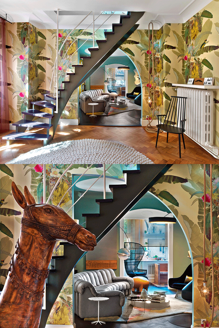 |
| photo credit: ipolitto-fleitz-group |
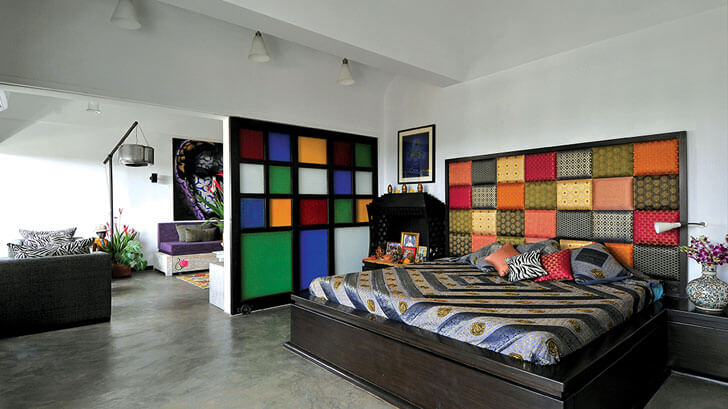 |
| photo credit: shabnam-gupta |
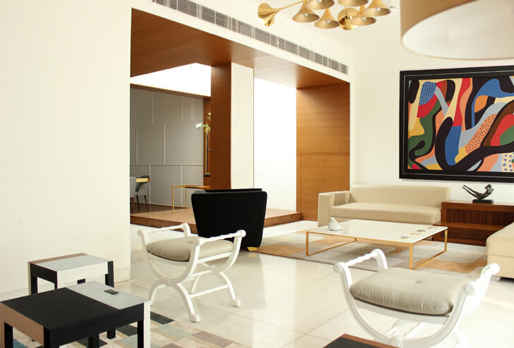
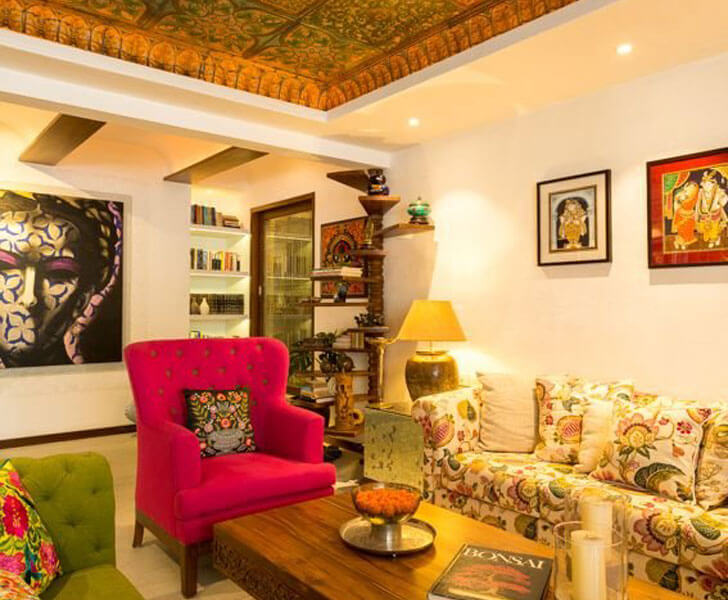
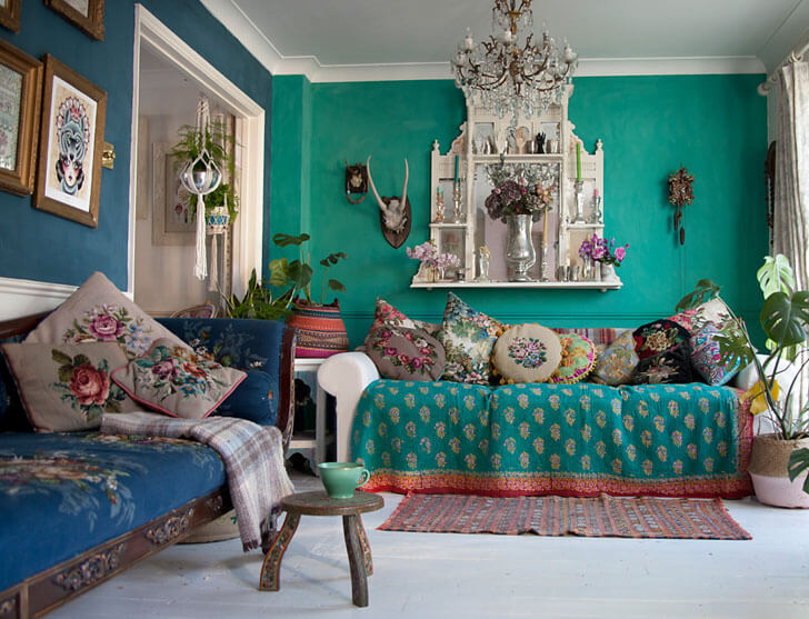
The I-me-myself trend: Patterns mixed to augment an eclectic ‘this is me’ look are on the rise. You don’t have to worry about matching colours or textures or prints. Go Bohemian with what you like and spearhead a new aura in your personal spaces. Dare to be different.
 |
| photo credit: shivan-and-narresh |
 |
| photo credit: varandas-mezzanine-architects |
 |
| photo credit: shabnam-gupta |
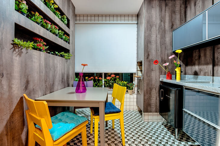
The accents trend: Playing on the visual arrest principle, juxtapose soft with prominent applications. For example, if your wallpaper or sofa or bedcover prominently shows off a bold floral print, pick out some colour accents and match the hues in smaller accessories like table runners, throws, a vase perhaps… again pay attention to the hue but the patterns could be anything at all!
 |
| photo-credit: BFDO architects |
 |
| photo credit: moriq-architects |
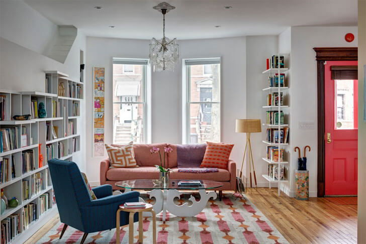
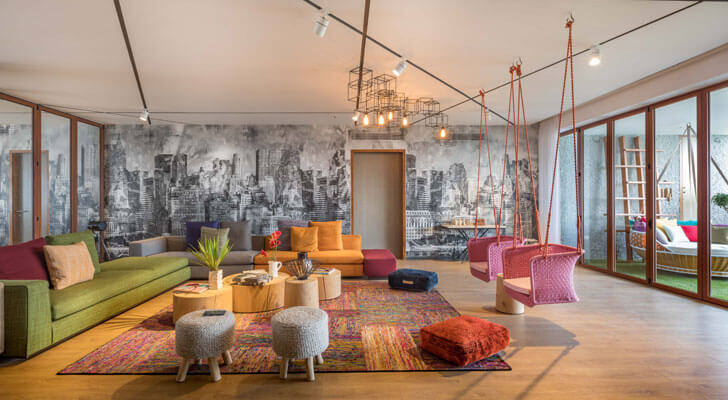
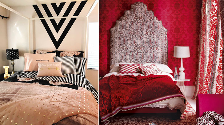
The fail-safe trend: Combine unusual hues but from the same family – peach, rose-pink, a touch of fuschia elegantly paired with may be just one equally subtle contrasting tint, carefully working around a focal point. Since this is the tried -and-trusted method, no matter what you do, it will stand out with aplomb!
 |
| photo credit: ideal homes |
 |
| . |
 |
| photo credit: vinita & sid interiors |
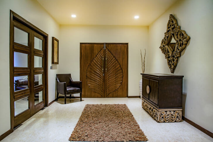
The adorable textures trend: If vibrant, in-your-face prints are not your cup of tea, you can still jump on the pattern-on-pattern bandwagon by mixing and matching an assortment of textures in neutral hues or by opting for tonal variations of a single hue; for example, tones of copper, gold, beige, burnt sienna...
 |
| photo credit: ipolitto-fleitz-group |
 |
| photo credit: ipolitto-fleitz-group |
 |
| photo credit: arqov workshop |
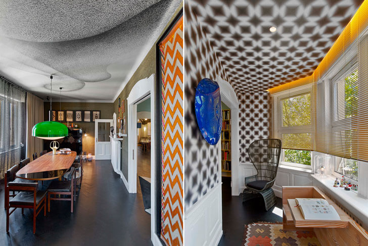
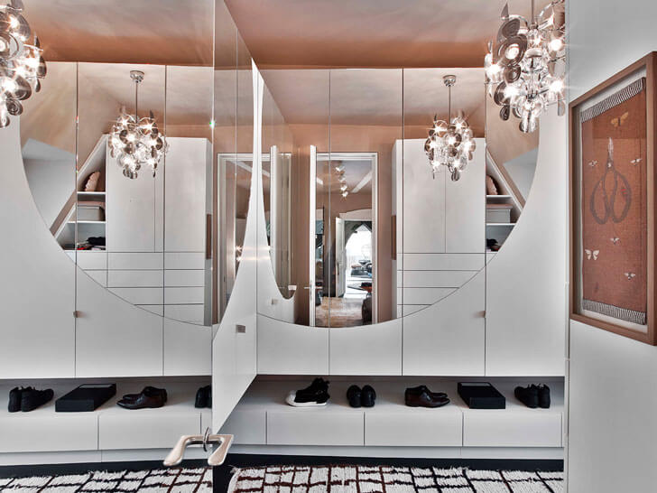
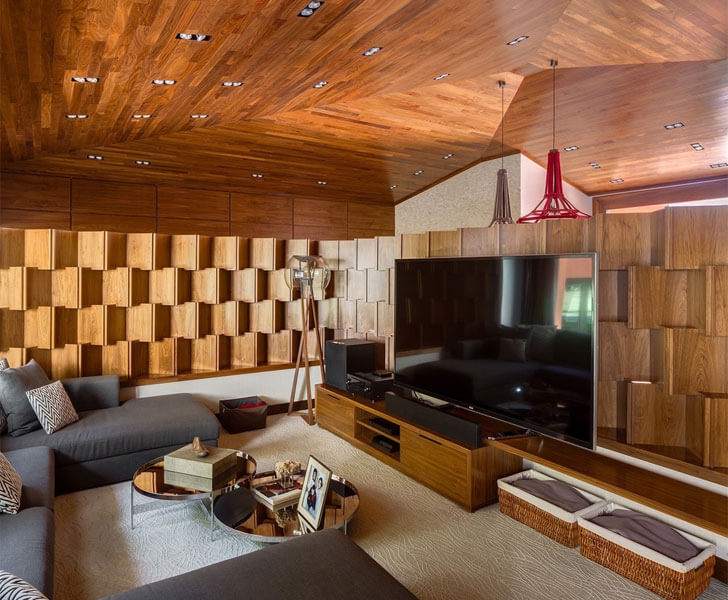
The exaggeration-is-key trend: Scale becomes the focal aspect here as you play with forms – big vs. small, bold vs. subtle; playing on an over-the-top version of any one element. It is best to vary size and shape to sustain visual interest.
Bottom-line: Follow your instincts. Never really cue in on advice as is. Bring in your personal style; strike your own oomph factor!


No comments :
Post a Comment