By Marina Correa
Photography: Vivek Shah and Karan Khosla; courtesy the firm
Read Time: 2 mins
Following its playfully reflective name Eleven 11, the theme behind this eponymous restaurant-cum-café designed by Saniya Kantawala portrays duality of space.
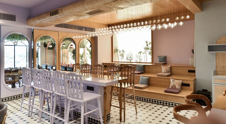
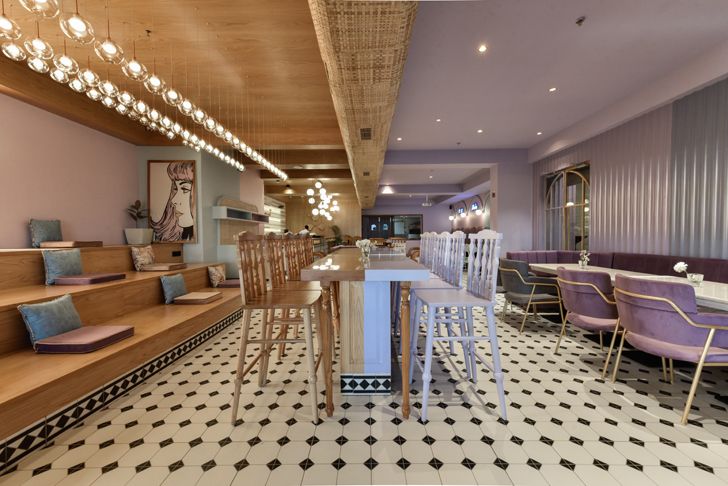
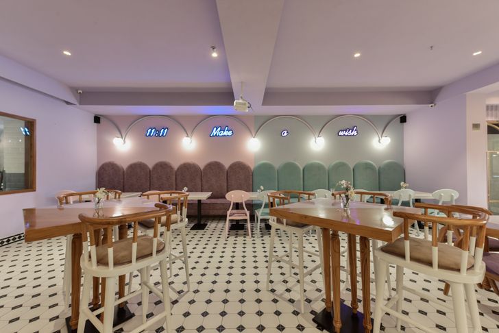
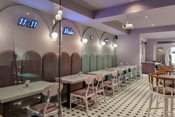
The idea was to convey ‘division and unity’ – at one and the same time. A visual narrative with strong duality sets the divisive tone, segregating the rectangular layout into two identical parts – one in lavender and the other in earthy tones of beige and brown. So, we have handcrafted wooden ply and veneer planks on one side and lavender tiles on the other. The identical layout of furniture and the uniform checked flooring pattern help in binding the space into a cohesive whole. Chairs and tables are split in half and done up in a 50:50 ratio of hardwood and Carrara marble painted-in-lavender. The juxtaposition of the warmth of hardwood against the softness of the dewy lavender balances out the disharmony perfectly.
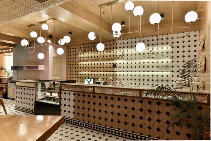
The same ‘divide to unite’ theme carries forth in the bar area with a combination of lavender painted walls and hardwood tiles, the ceiling chipping in to take this narrative forward. The principle of camouflage is put to good use by neatly tucking the HVAC services running across the ceiling under woven-cane coverings.
Overlooking no details, lighting is given its due diligence with a string of blown-glass drop pendants adorning the formal section and artistically globular white-tinted luminaries shining over the bar, to strategic spot and retro pendants in the café, culling out different moods and vibes to each section.
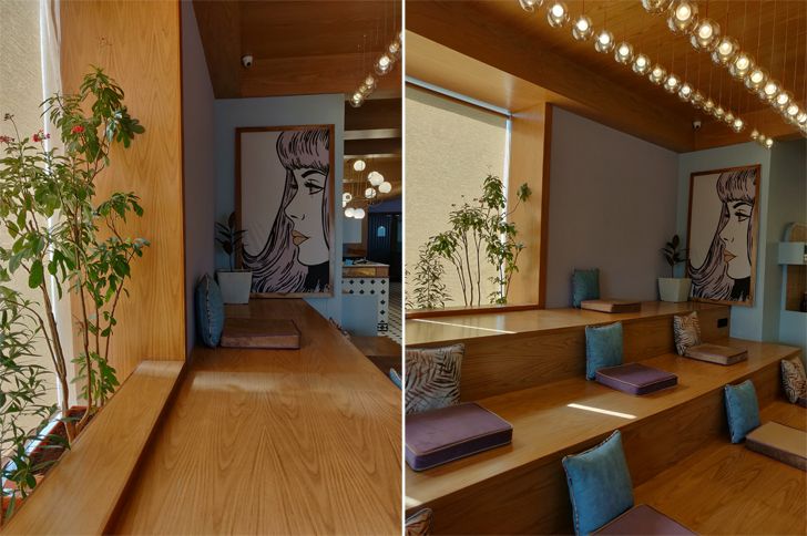
A variety of seating styles are seen - from formal straight-backed chairs and relaxed booth seating to tables with bar height wooden chairs and three-level amphitheater-styled step seating - infusing a happy mix of variety and vibrancy.
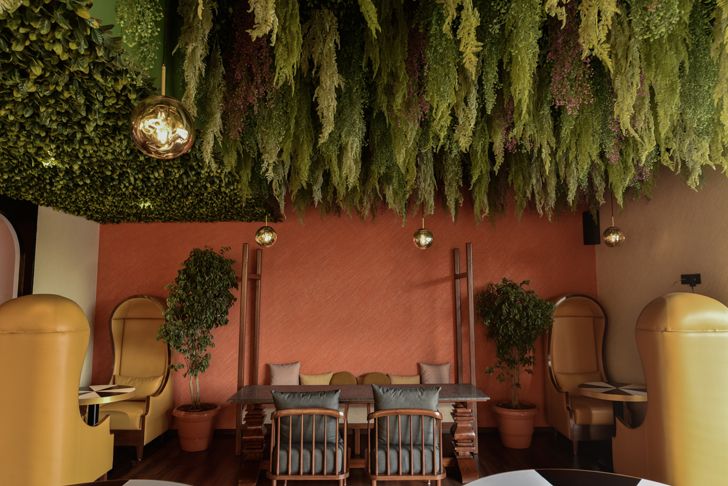
The alfresco café area stands apart from the colour coding of the restaurant. Rust coloured walls, cane furniture, greenery adorning the ceiling, golden hanging globules and large windows openings bring in a flood of natural light allowing for animated conversations amidst an informal vibe.
With its target clientele being the youth and young professionals, funky pop art posters and plug and play points at the amphitheater steps encourages a relaxed ambience whilst enjoying a delectable multi-cuisine menu.
Coupled with greenery, natural light and services undertaken only from local craftsmen, the project makes a chic and sustainable statement simultaneously encouraging a convivial co-working ambience.
Fact File:
Clients: Nitin Kakwani and Rajesh Keshwani
Design firm: Saniya Kantawala Design
Principal designer: Saniya Kantawala
Area: 2,000 sq.ft.
Location: Ahmedabad, Gujarat



The Interiors are absolutely awesome. Your idea of division and unity is wonderful. Thanks for sharing these wonderful interior, Exterior designs
ReplyDeleteOh my goodness!! The Interior designs look awesome.
ReplyDelete