By Team IAnD
Photography: Courtesy the designers
Read Time: 2 mins
 |
| . |
The Spatium Interiors peps up a basement in suburban Mumbai with a sleek fashion statement: Ease - a minimalist clothing label hidden in exclusivity…
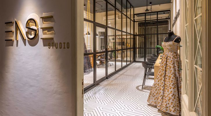
Retail architecture is usually characterised by shop fronts seeking maximum attention of the passing-by customer; and a footprint that revolves around the products. Here is a complete turn-around of this dictum: The Ease boutique sits on a comfortable footprint of 700 sq. ft. in a large basement of a building in Borivali West, Mumbai and operates on a very personalised note, where each one-to-one interaction with a potential client is facilitated in quiet, uninterrupted surrounds - the key lying in focussing on the client and her fashion quotient.
 |
| . |
 |
| . |
 |
| . |
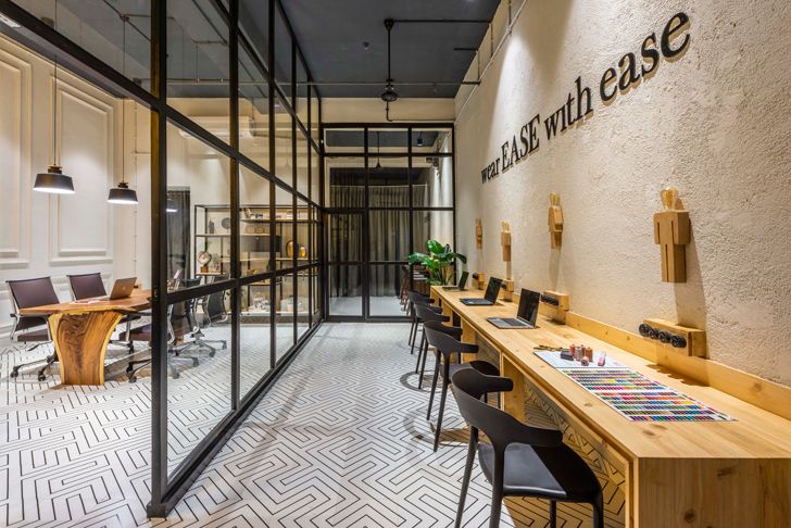
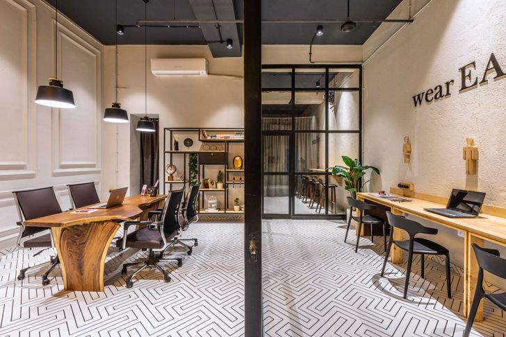
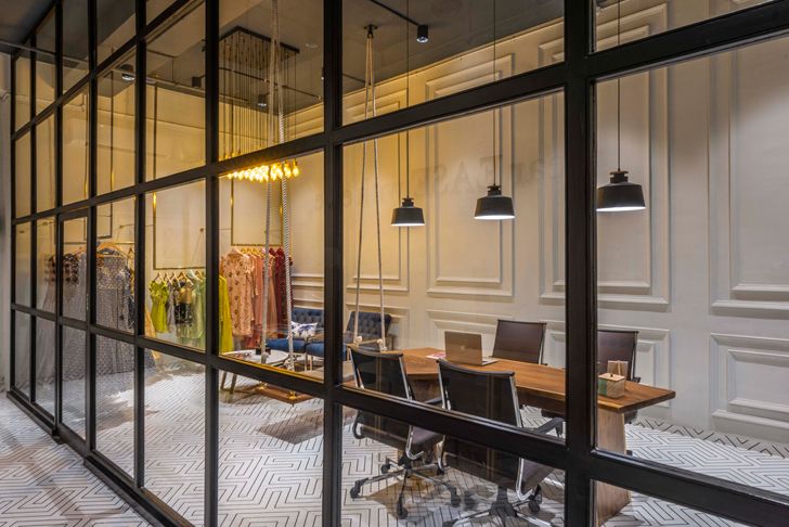
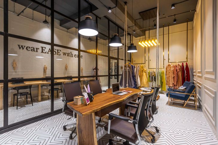
This is a prime reason why unlike the conventional approach, only a very small section of the boutique is devoted to the display and the onus is more on the comfort of the client (there is a mini café tucked within) and servicing of her needs. The seemingly linear footprint is split one-thirds/two-thirds into two sections: client servicing and office admin. Other areas viz. a trial room, mini cafe and a space for kaarigars to work are all tucked into the back, beyond mirrored walls.
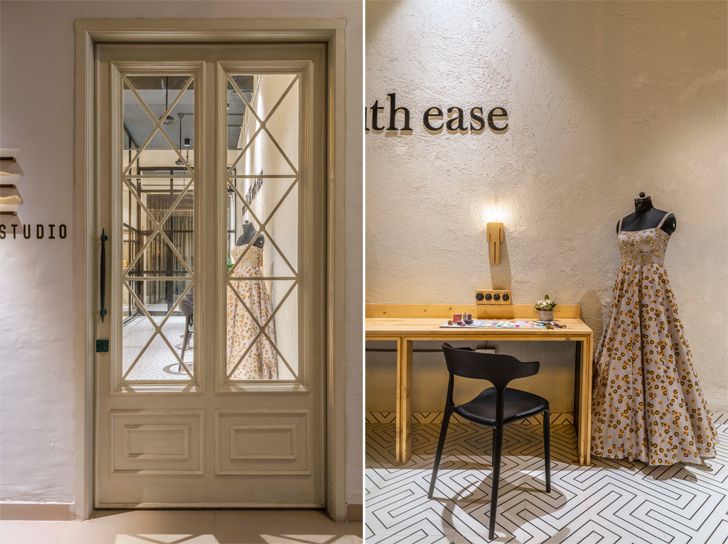
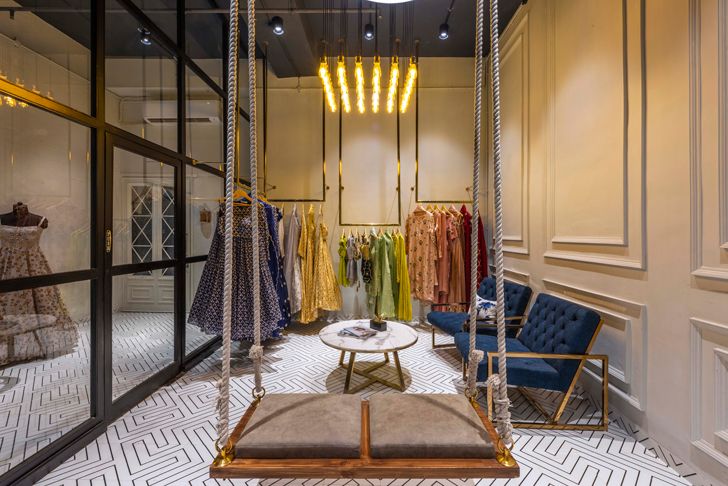
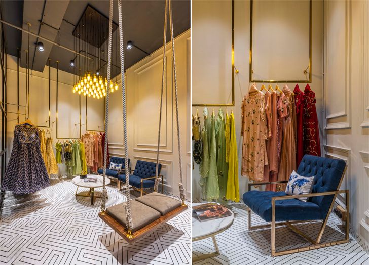
EASE is an exclusive boutique of Indian traditional clothes housed in a space that expresses neutrality across the built mass; thus, allowing the striking apparels to take centre stage. A plethora of lines (subtle and in-the-face) define the interior envelope: in the brass arms of the furniture; flutes of the panelled walls, criss-cross pattern on the entrance door, clean service lines in the dark grey, open, industrial ceiling, straight-lined pine woodwork tables, the simple yet striking maze-look-alike flooring; floor-to-ceiling glass partitions… and the like.
 |
| . |
 |
| . |
 |
| . |
 |
| . |
Little focal points weave in a subtle element of intrigue viz., the jhoola, vintage toggle switches, (overtly marking the traditional bent of the brand) and the bespoke lighting… keeping the visitor engaged and ingeniously offering a subtle recall factor. On the technical front, use of a double exhaust, wherever possible, addresses the issue of ventilation, which was a major concern being a basement.
What stands out is the simplification of thought and the solitary element of design (the line) that cohesively used, ties the various sections together into a chic, understated fashion destination – guided by pragmatics and sans the frivolity that often accompanies this segment.
Fact File:
Clients: Vidhi and Khushboo Purohit
Design Firm: The Spatium Interiors
Principal Designers: Sagar Deshmukh, Anil Panchal and Vandana Deshmukh
Built-up Area: 65.03 sq. m. (700 sq. ft.)
Location: Mumbai

No comments :
Post a Comment