IAnD Exclusive
Hospitality Special
By Shreeta Nair
Photography: Darshan Savla; courtesy the designer
Read Time: 2 mins
 |
| . |
Saniya Kantawala Design takes Ar. Zaha Hadid’s iconic quote - ‘‘There are 360 degrees, so why stick to one?” to an all-new level with her design of Mumbai’s new bar and restaurant, Esora!
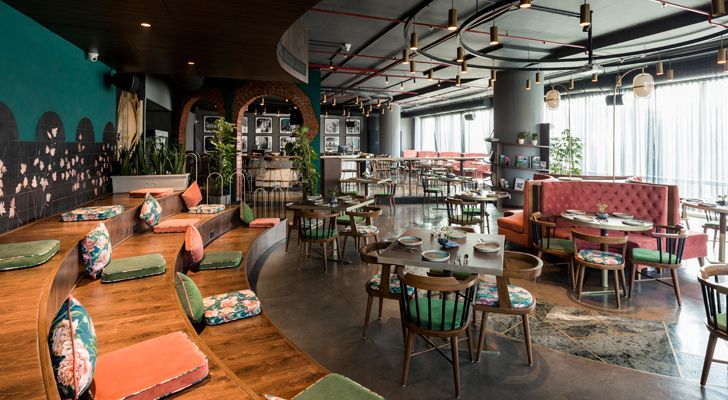
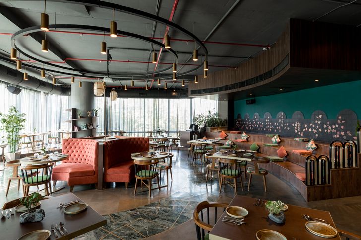
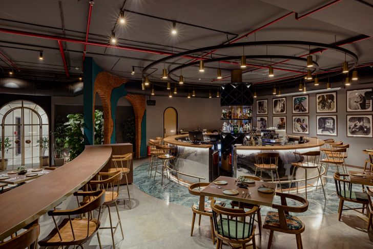
Taking inspiration from the veteran architect’s thought process, designer Saniya Kantawala sculpts five zones creating zoning creating an interesting interplay of levels and varied seating styles to accommodate a total capacity of 106 covers; working on a circular layout in an otherwise seemingly-rigid but, spacious 3000 square feet rectangular space.
 |
| . |
 |
| . |
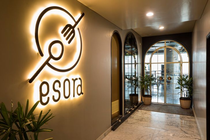
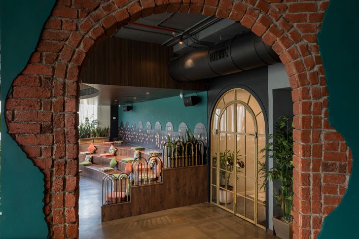
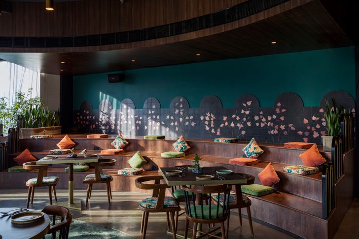
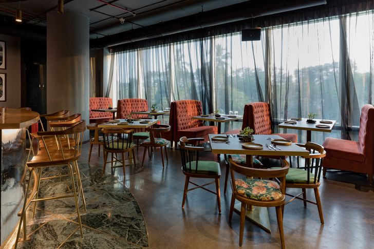
Crafting out a unique and asymmetric design, the space has a pleasantly inviting and cosy vibe with soft jazz music playing in the background. Moving right from the centrally-positioned entrance, one sees the amphitheater or arena-style seating on either side fringed by quiet tables along tall windows and relaxed, stepped seating built of a ply structure finished with wooden flooring and tropical coloured cushions that adds some drama and warmth to the space.
 |
| . |
 |
| . |
 |
| . |
 |
| . |
 |
| . |
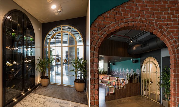
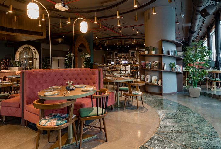
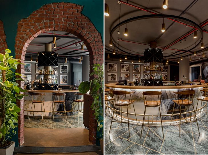
There is seamless blend of understated elegance and simplicity. The bar to the left of the entrance is approached through beautiful fire-brick arches splashed with a bright emerald paint finish; a step-up level towards the circular bar and the more casual section of the restaurant is dotted with high bar seats and booth seating. The bar itself displays an ethereal art poured over solid sheets in black, white and champagne gold, whilst its display resembles a wine cellar rack wrapped in dull gold laminate. Completing the schematic are the sublime stone-grey wall and ceiling finishes that camouflage electrical conduits. Moving away from the bar, at a ground-drop of six-inches is an area designed to cater to larger groups.
 |
| . |
 |
| . |
The flamboyant colour palette of warm grey, dull cherry, vibrant emerald and champagne gold as well as the tall and wide windows that bathe the interior with abundant daylight, draped with charcoal-grey sheers unfailingly add to the warm and cheery vibe of the entire space, making sure that it has something to offer to divergent palates – casual as well as fine dine; even encouraging students and working professionals to squat for a chat, some me-time or what's more, accomplish some serious work amidst hungry bites.
Fact File
Client: Divya Kadam & Sagar Neve
Design Firm: Saniya Kantawala Design
Principal Designer: Saniya Kantawala
Design Team: Nidhhi Nair, Nida Sheikh
Total Area: 3000 sq. ft.
Location: Goregaon, Mumbai

No comments :
Post a Comment