By Beverly Pereira
Photography: Space Advertising Agency; courtesy the designer
Read Time: 2 mins
 |
| . |
Studio Osmosis uses a minimalist approach to stylize a show apartment that appears spacious, chic and cozy, all at the same time.
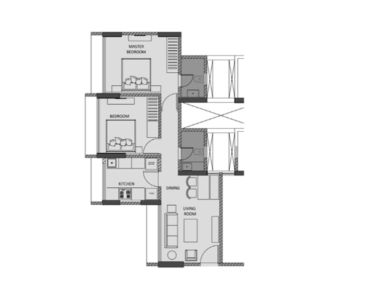
In space-starved Mumbai, shrinking apartment sizes are proportionate to affordability, and homes the size of a match box appear unsightly and claustrophobic. But this isn’t always the case, as is evident in a show flat designed by Studio Osmosis. Situated in the multi-storey high-rise Suparshwa Urbana in Andheri East, Mumbai, the 600 sq. ft. apartment is turned into a desirable home using clever and tasteful hacks — including the underlying guidelines of minimalism.
 |
| . |
What the apartment lacks in size, it makes up for in its luxurious, modern but simple design. The play of minimal design elements, subdued colours, lightweight furniture, subtle textures on the ceiling and high-end finishes work in tandem to give the illusion of a much bigger space.
 |
| Add caption |
Following an open-plan layout, mirrors serve to enhance the living room area, adding a touch of glamour, while large French windows bring in ample fresh air and natural light. A controlled palette of grey soft furnishings works with taupe-mushroom walls to lend the appearance of a clean, open and inviting space. A careful selection of furniture, artefacts and art, featuring pops of colour and pattern, injects nuances of intrigue and vitality throughout the apartment.
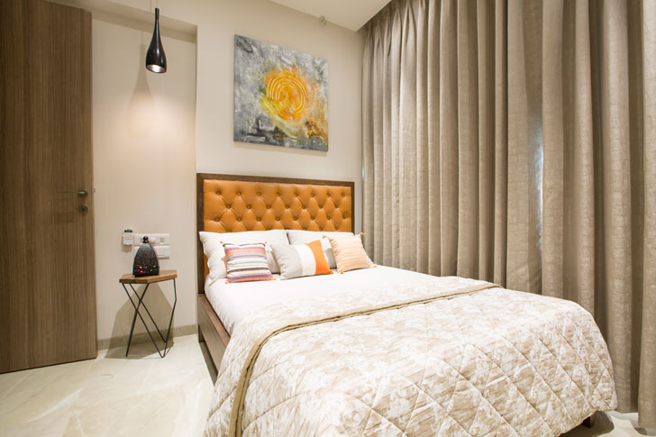
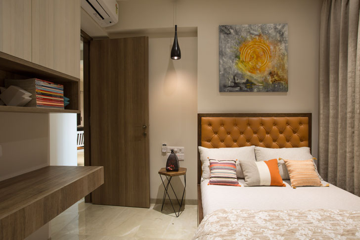
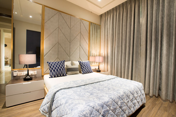
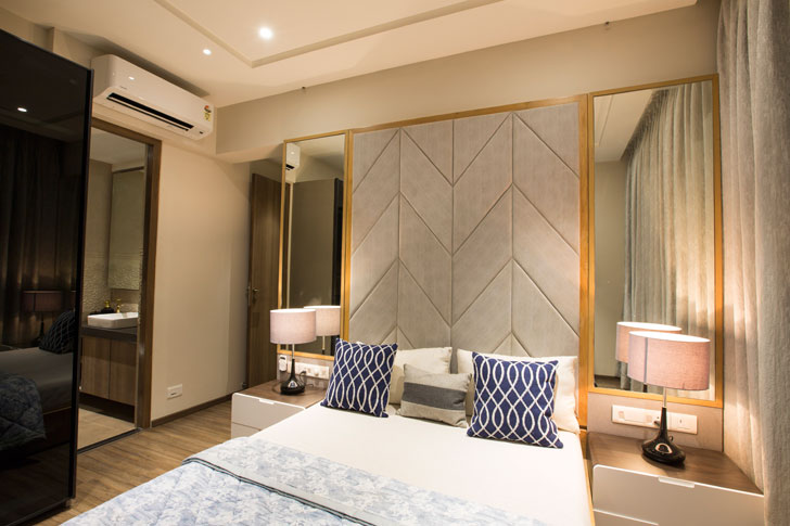
Simplicity and luxuriousness find their way into the bedrooms, too. Plush undertones viz., laminated wooden flooring paired with a framed velveteen headboard; mustard yellow quilted leather headboard and a glossy black pendant lamp and the like are standout design elements. The use of mirrors is sustained and continues into the bathrooms, where a mix of vintage-patterned tiles form an earthy highlight.
 |
| Add caption |
 |
| Add caption |
Instead of opting to paint the home in all-white to effect a spacious appearance, the architects cleverly employ an eclectic mix of focal elements that aren’t heavy in terms of design.
Fact File:
Client: Suparshwa Group
Design Firm: Studio Osmosis
Principal Designers/Architects: Shilpa & Sameer Balvally
Area: 600 sq ft
Location: Mumbai

I have perused your blog its appealing, I like it your blog.
ReplyDelete