By Rutvi Ashar
Photography: Courtesy Gautam Desai Design
Read Time: 2 mins
 |
| . |
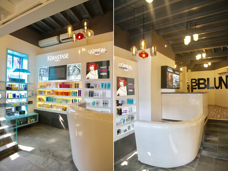
The rich inviting salon-front of BBlunt’s flagship quickly changes into a soothing haven inside at the hands of Gautam Desai Design...
BBlunt’s flagship in a South Mumbai heritage building undergoes a total makeover at the hands of architect, interior designer and stylist, Gautam Desai, who adeptly harmonises the contemporaneity of the fit-out with its heritage shell.
Known for bringing-to-board not just building expertise, but also a sound understanding of branding, visual merchandising and stylization, Gautam’s design strategies work towards an easily replicable footprint for the next-generation salon at locations throughout India.
 |
| . |
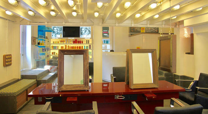
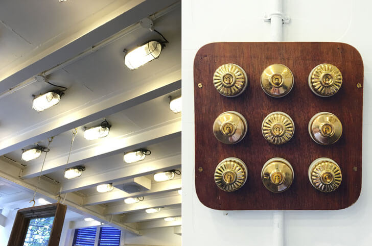
The 1200 sq. ft. space is split into three-levels; where the second level is more like a sandwiched central deck that enables a smooth transition between beauty routines. Due to height restrictions, industrial-grade metal bunker light fixtures light up the stacked levels and induce a sense of aesthetic continuity.
 |
| . |
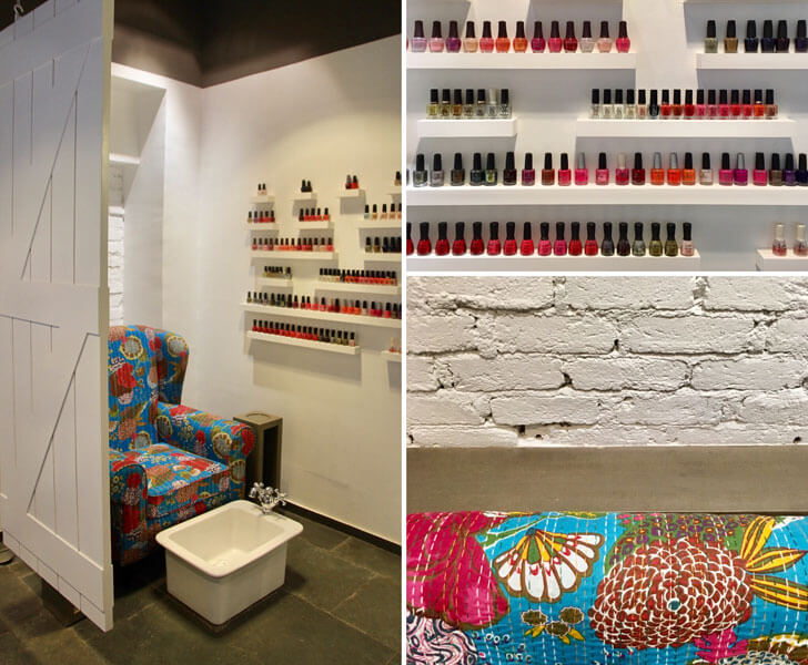
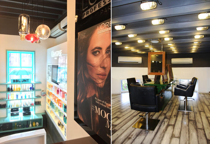
Catering to high profile clientèle, privacy is ensured for hair rituals and grooming in addition to the more general space that configures twelve hair-styling, cutting and colour stations besides four shampoo stations, a colour bar and retail and storage areas; not to forget comforting zones (reception and waiting) for the clients and staff alcoves.
 |
| . |
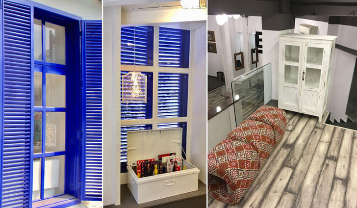
In salons, where the focus is on a tranquil and calm mood, colour palettes rely heavily on cool hues; although the designer efficiently retains the stunning Venetian windows (painted a deep royal blue), almost metaphorically alluding to the era of kingdoms, when ablutions were ceremonial.
 |
| . |
Having said that, the beauty of the salon lies in the detailing: its grey and white interior envelope with its exposed steel ceiling-joists and flagstone ceiling is anointed with rough-slate flooring, white-wash floor boards, high-gloss and distressed furniture, bell-jar lighting fixtures, quirky accessories and funky wallpapers. Colour pops appear to enliven the space in product bottles and packaging as well as in select soft furnishings.
The salon appears grounded with a diabolic essence of transience – probably unwittingly – as the furniture and mirrors in the central deck appear suspended infusing lightness in the interior. All-in-all, the salon essentials seamlessly weave into the existing floor plate giving this heritage structure another purpose!

No comments :
Post a Comment