
Colour Special
By Rutvi Ashar
Photography: Courtesy Sebastian Zachariah
Read Time: 3 mins
 |
| . |
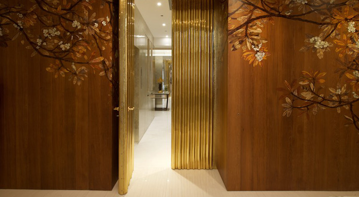
Metallic hues nudge nude tones as various process-oriented crafts augment the exploration of a neutral palette in this sumptuous Mumbai-home by AV Fourth Dimension...
With a strong idea of what he wanted, the client approached designer Amee Vora with what most might call a very challenging task: a luxury spread with a limited choice of ingredients! Armed with her contemporary style and knowledge of indigenous techniques, Amee and her team worked on this 5000 sq. ft. two-storey home to deliver the classic Indian, elevated bungalow experience.
 |
| . |
 |
| . |
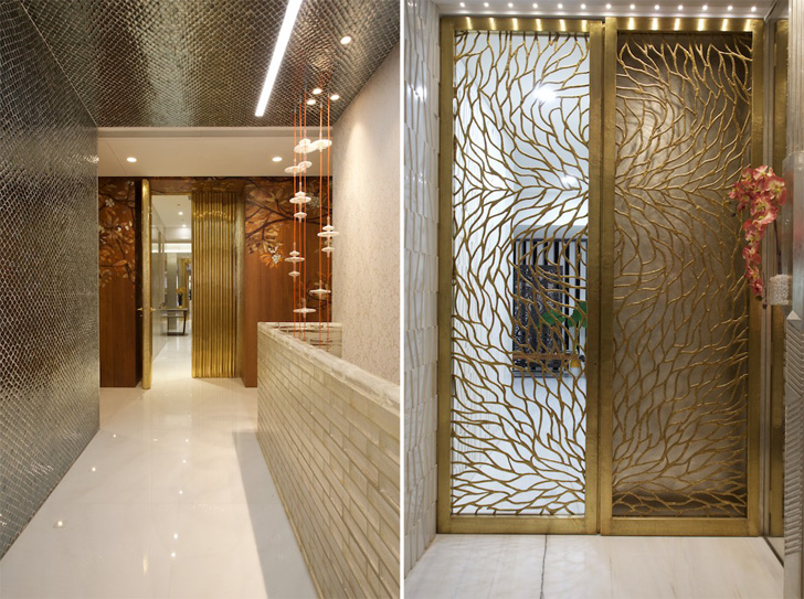
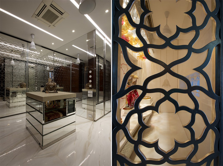
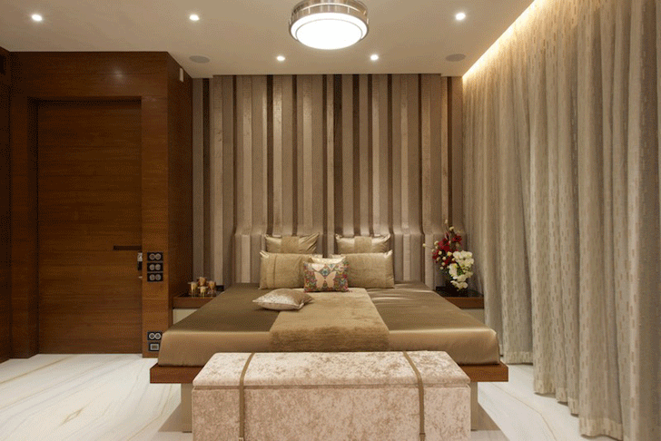
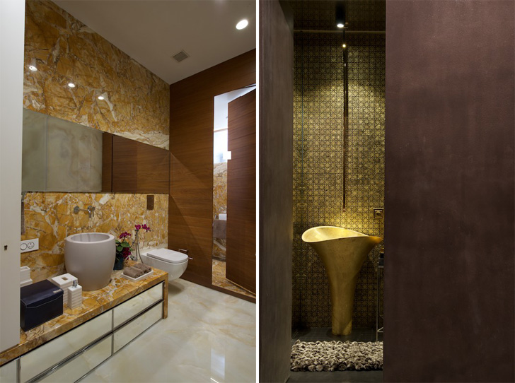
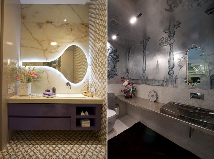
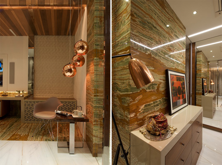
A number of carefully chosen elements standout in the individual spaces, only to ingenuously unite harmoniously in the entire home. Layering both materials and colours allows the spaces to be open to interpretation; a valuable characteristic as the users’ age group ranges from 3-70 years. Essentially Indian details viz. brass rafters; hand-cut glass and mirror mosaic, foil inlays and many more... make their way into this free-spirited design.
 |
| . |
 |
| . |
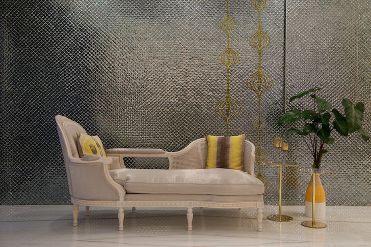
A mature understanding of tints and shades along with their attributes promotes this project from a regular residential interior design to a sought-after intervention. Amee and her team have paired nude tones with metallic materials, textures and most surprisingly, colours. The apt use of contrasting and complementing hues has helped in creating a function-meets-emotions situation.
 |
| . |
Working with preselected Italian marbles, a limited spectrum of materials in a minimalistic palette of colours, glass and mirror, colour spotting, and the balancing act with lighting, the designer succeeds in delivering an understated, uber lavish look!
 |
| . |
 |
| . |
Expert Speak by Amee Vora: It’s the value - relative darkness or lightness - assigned to a hue/tone that creates the spatial illusion besides the mood. Materials with closer values flatten the space and closely connect it. Contrasting values separate elements and allow one to stand out more than the other.
 |
| . |
Here, the client's brief was a white and silver palette with splashes of gold. So the metal was chosen to bring in luxury. Gold and silver were applied as a contrast to the chosen muted tones, driven by the areas and forms that I wanted to highlight – thus achieving the luxurious look and facilitating the metal texture to speak.
No comments :
Post a Comment