By Savitha Hira
Photography: Courtesy
Zero 9
Read Time: 2 mins
 |
| . |
Anu and Prashant
Chauhan of Zero 9 have bagged the A+Design Award 2016 for their Dimexon Expo
Stand – a modular, knock-down concept that not only drives brand recall but can
be reprogrammed each time for changing needs and rejuvenated visual appeal...
Three parameters
drive the design – technology, simplicity and engineering; not necessarily in
that order! Turning the concept of privacy and security on its head - especially
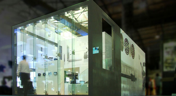
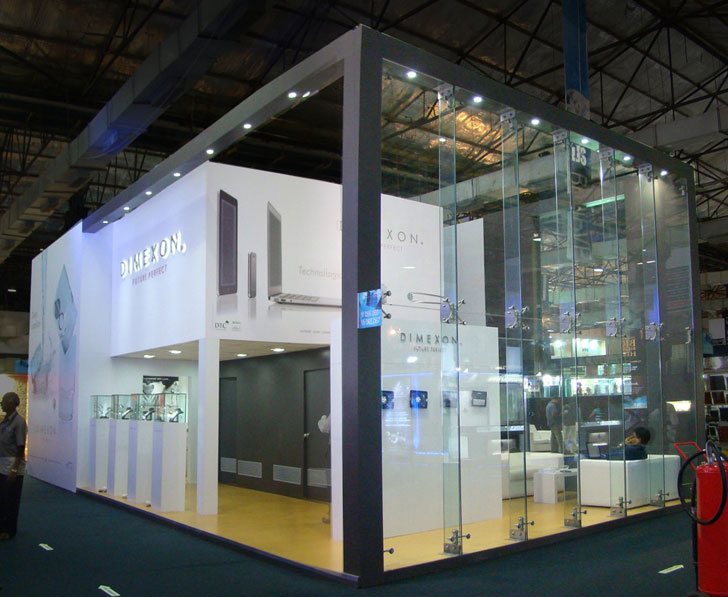
for a high end jewellery line - they’ve opened up the exhibition pavilion by
using a transparent spider-glazed glass facade to maximise its visual impact
and augment its grandeur; a fact that not only bodes well for attracting
eyeballs but goes a step further in its aura of intrigue to invite footfalls
aplenty.
Following an
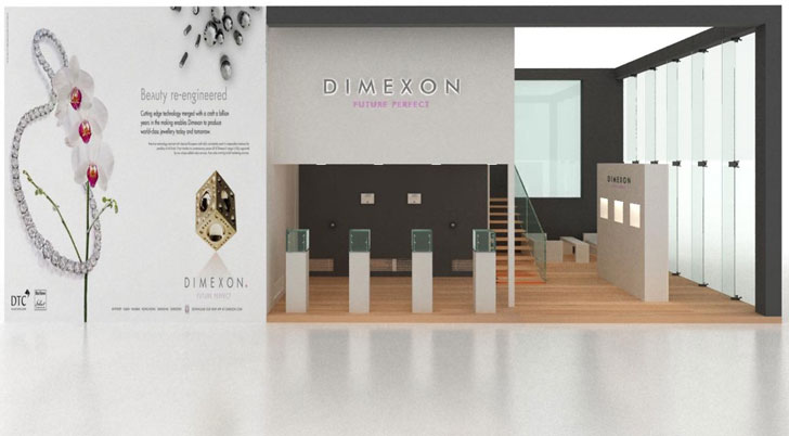
overall framework of 6 metre x 12 metre, minimal lines chisel the ground plus
one program with a mezzanine in tow complemented by a double-height entrance
area, sleek staircase and two pantry areas, complete with a dumbwaiter system and
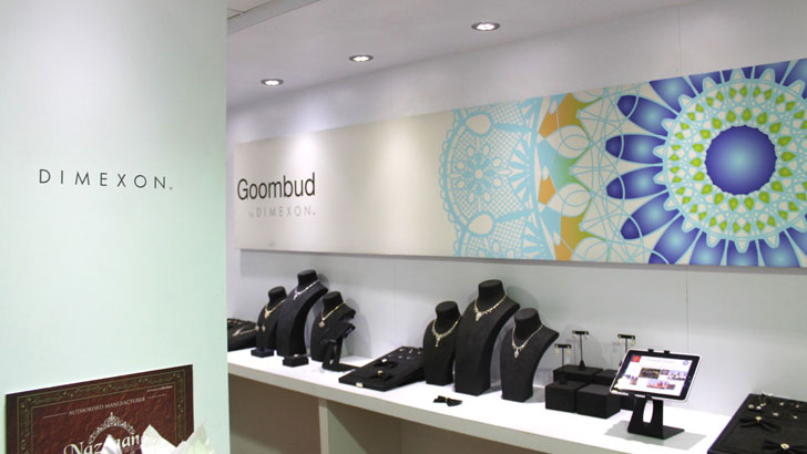
pulley that can deliver from lower to upper pantry; besides, ‘by-invitation-only’
jewellery viewing room and meeting rooms on the first level.
“The idea was
born out of the brand ideology of the client, Dimexon Diamonds Ltd.,” informs
Prashant relating how the concept was born in about three hours flat over two
cups of brewed coffee. Detailing the concept took about a month and the design
is fitted out such that it can be dismantled and stashed away, to be reused
with appropriate cosmetic changes in terms of laminate finishes and images in
tandem with the brand’s current prerogatives.
With Dimexon
taking its business online, the expo stand also ingrained the use of
techno-logic, where iPads were used for communicating and taking orders; and to
educate customers about the app available.
Bearing in mind
the apparent need for a business to showcase itself at multiple annual trade
shows, this concept of a nut-and-bolt, knock-down structure proves a versatile
solution to parry down costs, increase the shelf-life of a design and still
remain in-the-now with marginal investment on cosmetic and theme-pertinent
additions/alterations; simultaneously building on a signature-style brand
language. There is just one catch: the advance decision of showcasing in a set
prefixed area, each time!


I have seen plenty of dismantled type of exhibitions in my career in advertising. But this eats the cake. Today the sheer availability of modern materials make this area very interesting. Hats off to Anu & Prashant Chauhan.
ReplyDelete