By Udita Chaturvedi
Photography: Purnesh Dev Nikhanj; courtesy Studio
Ardete
 |
| . |
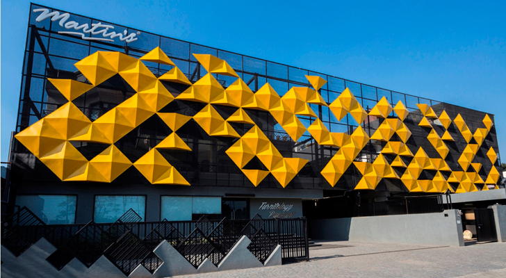
Studio Ardete applies the Japanese art of origami to design a unified
façade for two distinct buildings, establishing a brand identity for the client
in addition to dispelling the mundane and grabbing eyeballs…
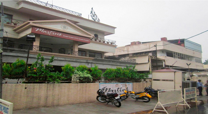
The owner of a three-storey furniture factory-cum-display centre, with
an integrated workshop, in an industrial area of Panchkula in Haryana sought a
design solution that could visually connect his outfits as one entity. However,
local by-laws necessitated that individual characteristics of the buildings be
retained. So, working on the option of unifying the façade, Studio Ardete
worked on a design language that sought the company’s in-house expertise for
designing an external screen of expanded metal and especially designed FRP
panels.
Origami and its interpretations in art and modern architecture have
allowed the design to be a rather fluid concept, which enhances the appeal of
the building without compromising on the functionality of the design. Although
origami, here, stands out as a boldly defining feature, it breaks the straight lines
that were otherwise seemingly blending into the neighbourhood chaos.
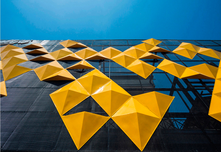
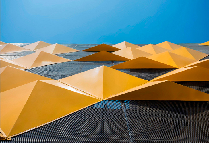
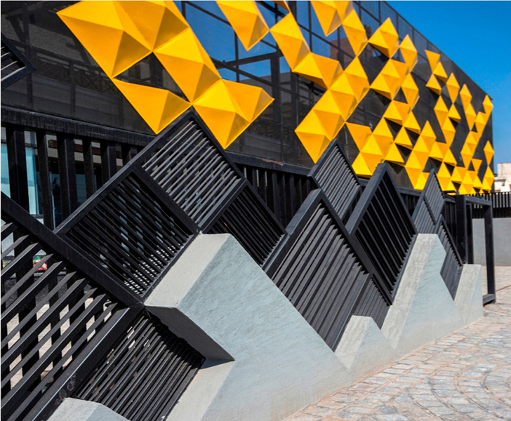
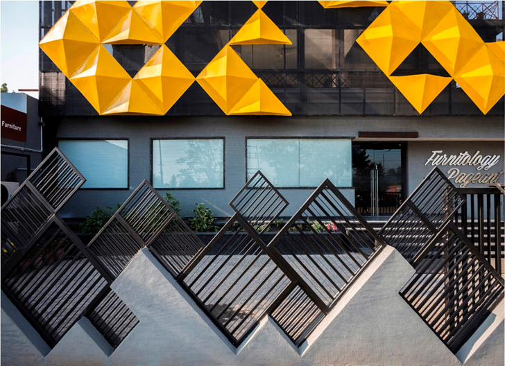
Besides breaking the monotony and dullness of the surroundings, these
origami-inspired sharp, triangulated yellow panels also shield the building
from the South heat gain and add a new zing to the concept through their
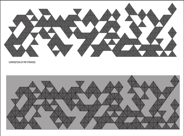
elevated dimensions. As no set pattern has been followed in the placement of
the panels, each measuring 19.35 sq ft, the random composition of the same in
an aesthetic manner adds an element of chaos in order.
To ensure that the view of the attractive façade is not obstructed by a
high boundary wall, slanting black panels with horizontal and vertical flutes are
placed on a low cemented boundary wall. Additionally, they also provide the
required security.
While
the combination of yellow and black beautifully complements and contrasts each
other, the colours reinstate the unique and contemporary design that changes
the architectural language of the region, making it more open and accepting,
paving the way to greater experimentation and better aesthetics.



I really love your blog there's a lot to share. Keep it up.
ReplyDelete