By Udita Chaturvedi
Photography: Courtesy the designers
Breaking the stereotypes of most fitness centres, without taking away the required sturdiness or compromising on the purpose, Moksha in Panchkula, Haryana comes across as a peppy space…
More than a new-age fitness centre, Moksha is an example of interior architecture, where major constraints have been overcome with thoughtful design solutions using simple materials.
Designed by Studio Ardete Pvt Ltd., Moksha as an extension to an existing gymnasium accommodates increasing footfall, besides additionally playing host to a spa and a spinning studio.
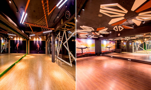
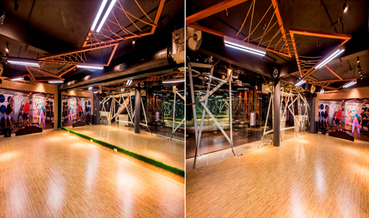
Spread across a basement area of 2,000 sq ft, it resembles a gaming arena — such as one that might be used for paintball, if there were more obstacles — thereby creating a competitive environment that would translate in the energy of fitness enthusiasts.
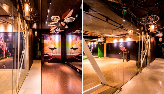
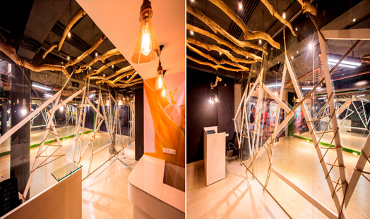
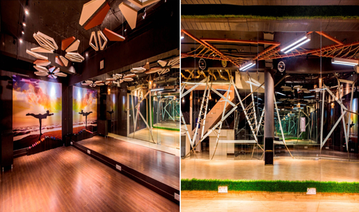
The challenge at Moksha was twofold: restricted space and limited budget. While the latter is addressed using cost-efficient material such as steel, wood and rope, space is dealt with by using mirrors. Glass is luxuriously used as partitions to introduce a sense of transparency and fluidity.
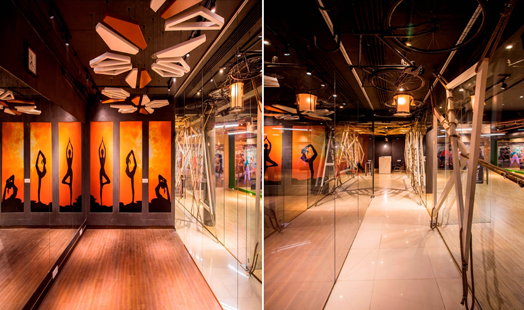
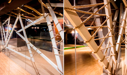
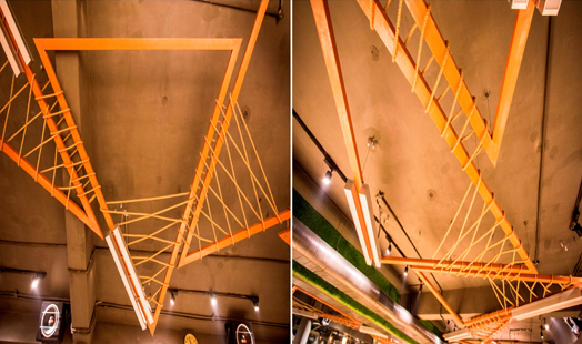
Imagined as an open and unconventional design despite the space limitations, elements of complexity are added through layering. These layers are visible near glazed surfaces as triangular steel frames interlaced with rope. The frames are mirrored in the ceiling as light fixture supports. The ropes, meanwhile, give the fitness centre a chic-yet-rugged look without compromising on the budget. Adding to this, are old bicycles that hang from the ceiling, and are used as symbols to achieve solidity.
A subtle colour palette in shades of browns, beiges and black enhances the quality of space and draws attention to diligence in details overhead. Colourful murals and posters, on the other hand, break the monotony of the theme and add a sense of energy and action.
Throughout, simple and linear planning combat the challenges of a basement space and ensure easy visual movement, making the space contemporary, urban and raw.

No comments :
Post a Comment