By Udita Chaturvedi
Photography: Dev Singh; courtesy M:OFA
 |
| . |
M:OFA Studios Pvt.Ltd. chisels an earthy, sober, yet refreshing salon,
making it stand apart from the milieu at a Gurgaon mall…
Whilst a neutral palette has always been timeless, there seems to be an upsurge of subtlety,
Design firm
M:OFA and its team lead Ar. Manish Gulati have discerningly corroborated a youthful place with an industrial environment and an upbeat design vocabulary in shades of neutrality.
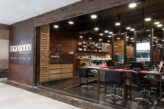
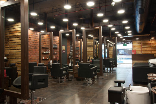
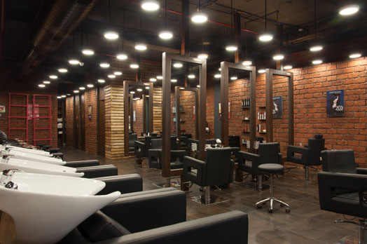
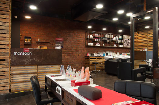
Complete with a lot of wood planks
and exposed brick walls, the salon boasts of controlled lighting that relaxes
the senses much like the services provided. Contrary to its brand imaging in
another part of the national capital, where the interiors are dotted with
splashes of red juxtaposed with eclectic design elements popping out as a scene
abuzz with life, this Gurgaon branch celebrates bare essentials with an
abstract outlook.
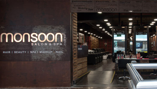
Setting the industrial tone, the word
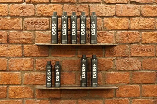
monsoon is laser cut into the top border of the façade in different typefaces,
as wood slats and exposed brick synchronize, lending horizontality to the space
and acting as partitions between the semi-rejuvenation and rejuvenation areas.
They serve a dual purpose - demarcating the requisite privacy, while letting
light pass through the distinctly divided sections for nail spa, hair styling,
pedicure stations, and beauty rooms.
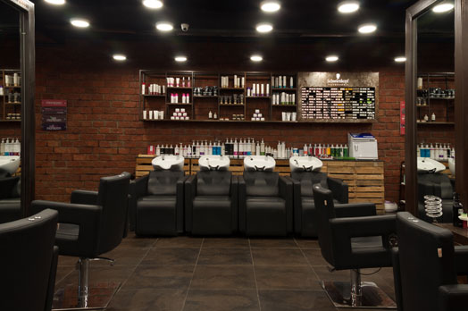
Juxtaposing this beautifully, and visually
enhancing the space, are floor-to-ceiling mirrors, seemingly pivoted on
vertical frames that instantly augment the height of the salon; while the
rhythmic ceiling orbs add depth.
Elements of light, clean epoxy
floors, back-lit mirrors, and wall-mounted display shelves lend the environment
a sense of being visually lighter. “Segregation of the spaces of seclusion and
activity were arranged thus that both of these seamlessly mingle to attain both
- the senses of ‘individual escape’ and a ‘happy mayhem,” explains the design
team.
What adds to the senses is the
neutral and more natural colour palette that compliments the green connotation
attached to the project. The interiors of the salon has a pronounced recycled
material vocabulary, which includes recycled shipping pallets, railway sleeper
wooden partitions, exposed RCC finish and LED lights.

No comments :
Post a Comment