By Marina Correa
Photography: Prashant Bhat; courtesy the
designer
 |
| . |
Principal interior designer
Kavita Shah of Purple Designs carves out a simple chic home for a young couple,
where clean lines and just enough furniture pepper the layout - leaving room aplenty for the home to grow…
Coherence throughout the 3 BHK,
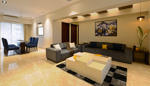
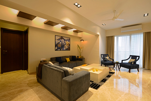
1,500 sq. ft. central-Mumbai elegantly designed home emanates from a simple and
restrained palette: both in terms of materials and colour. Marble flooring, wood
and white PU painted furniture anchor the materiality whilst beiges, browns and
crèmes awash the overall schematic.
 |
| . |
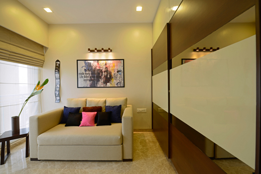
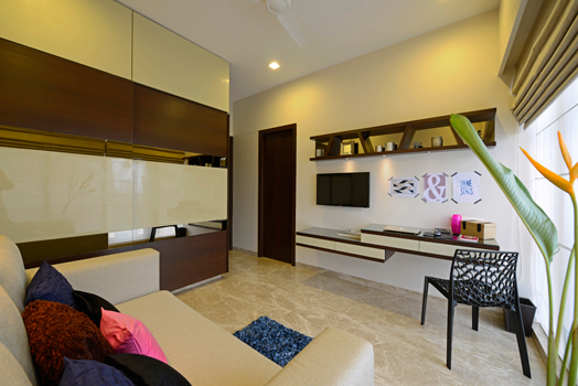
Vibrancy is infused in
small doses via rugs, vases, cushions and the like, where a touch of whimsy
comes forth through blurred paintings, a crooked photo frame and some fork-end
racks that adorn the walls – adding character to spaces, while keeping
artifacts beyond the reach of little hands.
A Zen vibe suffuses the
home which is perhaps triggered by a Buddha statue at the entrance lobby;
flowing past the living area characterized by a neat and fuss-free space that
adjoins an equally composed dining area, where a mandir is concealed behind a frosted glass panelled cabinet.
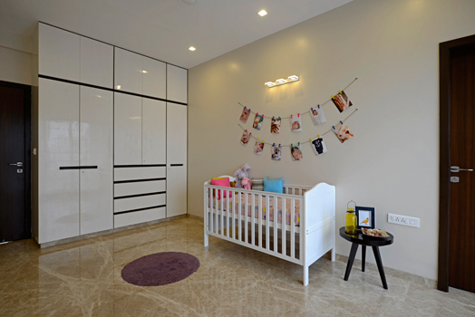
The overall calm vibrations
permeate the baby’s room as well, where light-coloured furniture, absence of
sharp edges or glass, concealed handles, kids-safe plugs etc., turn it into a secure
cocoon.
Pull-out drawer under beds,
cabinets and niches, walk-in wardrobes and even concealed storage below the
window sill facilitates generous storage options.
The site orientation and
many windows bathe the home in natural light; to maintain a balance, 100% blackout
linen blinds are used to cut off harsh sunlight.
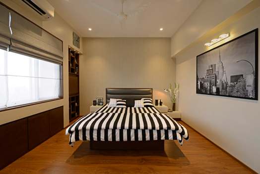
The designer shows
diligence in carving out a master suite as well as enlarging the master bath by
culling out space from the master bedroom sans
making it look small. Upholstered in black and white tones, the seemingly
spacious suite becomes the high point of the project, accentuated as it is with
the right measure of dress-up!



No comments :
Post a Comment