By
Savitha Hira
Photography:
Courtesy the architect
Collage Architecture Studio fulfills the aspirations of a family in
Bengaluru with an unmistakably open and engaging home in a tight plot of 1200
sq. ft. in the heart of an urban locale…
It is extremely rewarding, when a professional transforms a piece of
land into a home tailored to your needs; and especially so, when he does so
against a lot of odds. On a site spanning 30 x 40 ft., flanked by buildings on
three sides, the main challenge was to open up the site to natural light and
ventilation and make it homely and engaging, given the fact that there was
absolutely nothing to aspire for on the outside.
So we see the principal architects – Adwitha Suvarna and Swapnil
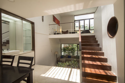
Valvatkar - working on a split-level programmatic, where spaces remain visually
connected, yet individualistic and functionally multi-defined to suit a
plethora of activities, easily transitioned from private to public. The
client’s requirement for three car parks aided their design, leveraging the
living areas to a higher floor, and gaining much in terms of volume.
The 2000 sq. ft. of built-up area comfortably accommodates the requisite
three car parks, four
bedrooms with attached toilets, living and dining areas, and kitchen and office space
without any semblance of constraints in space. Revolving around the key
features of modern, minimal and compact, the design ideology focuses on
maximizing the living experience via a large, open, central courtyard, internal
balconies, double-height spaces and skylights, encouraging interaction and
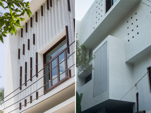
visual connectivity at multiple points. With walls treated more in a parallel
format than perpendicular, the spaces seem to flow into one another,
uninterrupted, appearing much larger than their actual spread.
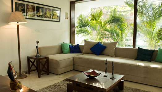
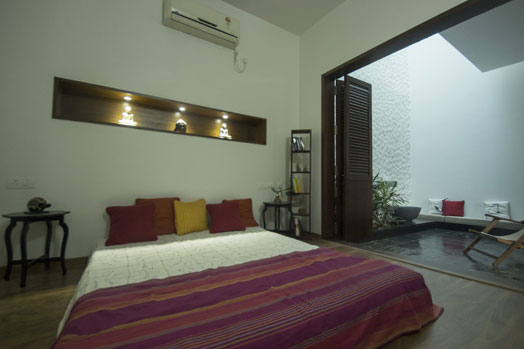
Working with a minimal palette of white and umber, the home comes alive
through pockets of narratives that almost beckon you to look beyond the visible
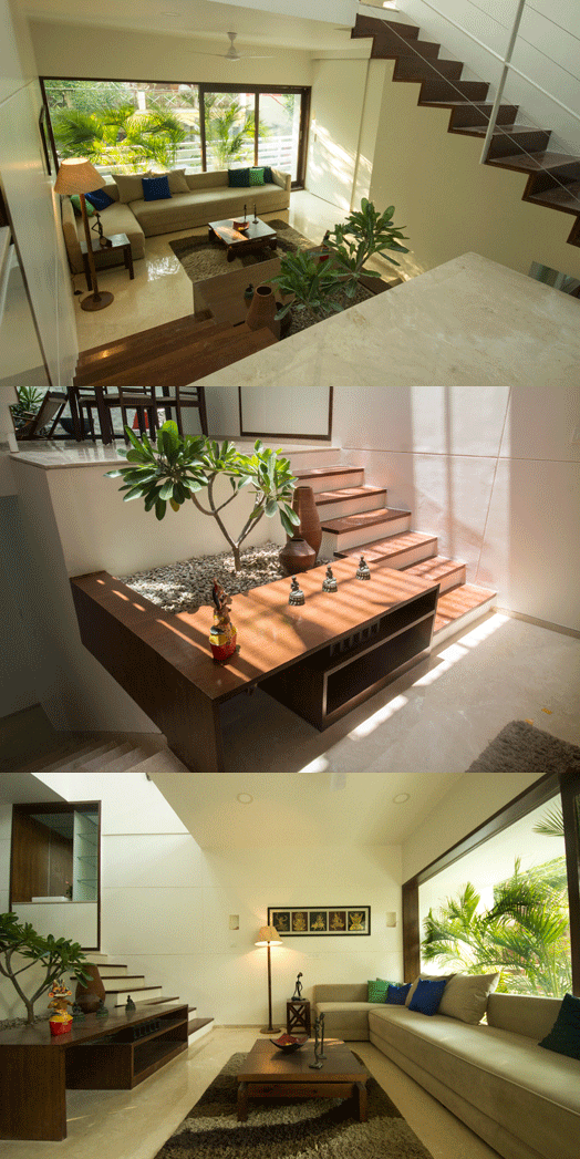
and find them. Like the natural plant incorporated into the living area, has its
planter base designed as a part of the steps, making for engaging additional
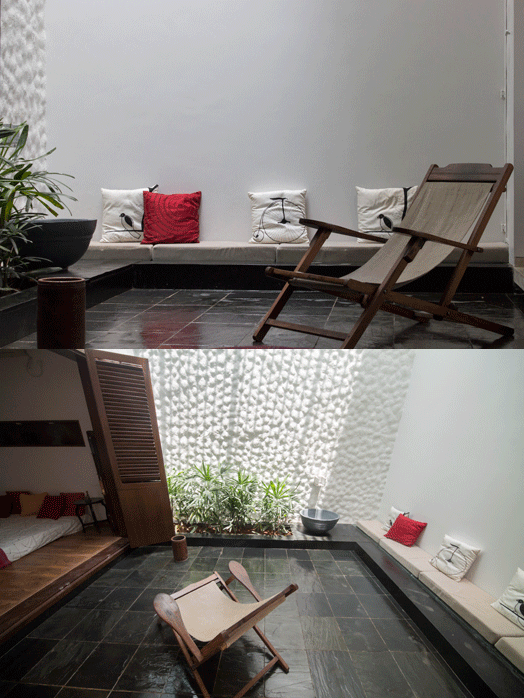
seating. Or the simple act of minimalist expressions on the cushion covers in
the small open-to-skylight patio-like sit-out opening out from the bedroom. Or
even the way the skylights cast their halos on the steps during sunny
afternoons, giving rise to intriguing chiaroscuro elements. This avers to the
attention to detail that goes into making the home inward-looking.



The looks like its just wow
ReplyDeleteNice!
ReplyDeleteNice to be visiting your blog, Well this article that I've been waited for so long.
ReplyDeleteAs a student I felt creativity oozed out as we were given our boundaries & limitations to work on . Now with more freedom , more creativity isn't the equation
ReplyDeleteArchitecture of the building is excellent. Very much impressed
ReplyDeleteIt's been a pleasure time while going through this blog. It stood quite useful for me as the content is related to my current matter.
ReplyDelete