By Beverly Pereira
Photography: Courtesy the
architects
.jpg) |
| . |
Design
Plus Associates embraces an open-plan layout in its industrial-themed office,
interspersed with dramatic elements...
Punctuating a
monochrome approach with striking graphics, art, pin-up panels, ceiling
elements and highlight furniture, DPA defines its architectural and design
sensibilities with a touch of simplicity and élan.
.jpg) |
| . |
As
Architect and President of the company, Sonali Bhagwati informs, “The design
language found its take-off points from the near-complete façade and the white,
grey and black colour of Alucobond and glass; as much as from the existing
haphazard structural elements on
the floor plate.” Translating the architectural aberrations into a design
element, an
unstructured orange streak - symbolic of the firm’s colours - runs along the
coffered ceiling with exposed services, unifying the randomly placed pillars
and walls within the office. Another limitation, the staircase, is transformed
into an eye-catcher with floor-to-ceiling graphics in white and orange, and
black and white project pictures with orange highlights.
The
interior is a play of just these three colours – with a fair amount of textural
nuances thrown in. Like, the reception is dynamically treated with a terrazzo
floor - grey slate rectangles inserted in charcoal resin; a bench signature Zaha
Hadid, chairs by Vitra and the wall-mounted company logo pack an instantaneous punch in the monochromatic ambience. The only place that literally offers the
break-out feel is the colourful cafeteria with its spunky wallpaper, recipe
graphics and brightly hued tables, all of which more than make up for the
controlled use of colour across the office.
 |
| . |
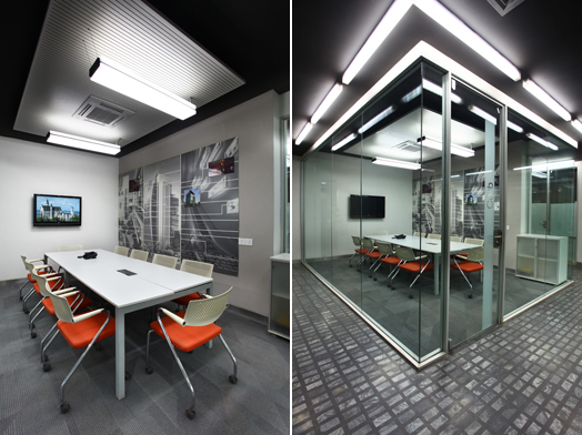
Functionally
driven, the two-levels of the office pertinently segregate the public areas –
admin, HR, meeting, conference rooms etc., on the floor below from the more
serious studio spaces above. The extensive use of glass throughout - for its
meeting rooms and glazing alike, creates an airy feel that brings in natural
light and offers verdant views from every work desk.
.jpg) |
| . |
If
the office was designed to offer heightened visual connectivity between teams
for synergistic ideas and positive energy, its exteriors
match this effort. The ground floor opens out into a garden adorned with Sonali’s
Balinese art and furniture - an oasis-like space that blocks out the urban
chaos.

.jpg)
.jpg)
.jpg)
No comments :
Post a Comment