By
Savitha Hira
Photography:
Prashant Bhat; courtesy GA Design
 |
| . |
Several aspects define building design:
locale, context, function, occupancy… that become significant determinants of
the final architectural make-up impacting cutting-edge dynamism that is the
order of the day...
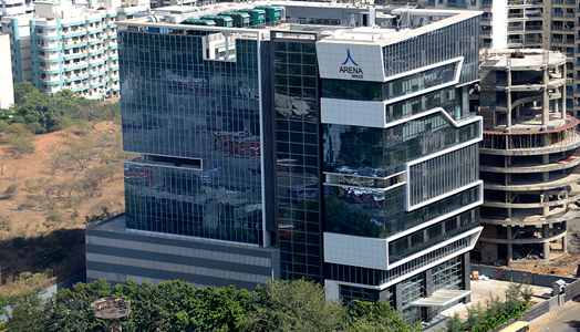
While designing Arena Space, the
eye-catching blue glass high-rise that captures one with its simplicity on JVLR
road, Mumbai, architects Rajan & Sachin Goregaoker of GA Design have oriented
it towards the north to keep it open to the skyline with three sides encased in
glass for uninterrupted strategic views; whilst the services are relegated to
the south.
.jpg) |
| . |
Conceived on the lines of a fluid ribbon,
which originates from the ground and wraps around the building, dynamically
spiralling to the terrace, the seemingly simple glass box is literally wrapped
in this ribbon, catching the eyes of passersby – a distinctive design in stark
contrast to its surroundings.
.jpg) |
| . |
The commercial office building exudes a
strong workplace identity, where each of its Vaastu-compliant seamless large floors
sits on a rectangular plate, hosting a single office fit-out. While the lower
three floors constitute a triple-height lobby on the west side, the ribbon
element expands and contracts on certain floors, exposing the refuge decks at
random intervals. As it reaches the top of the building, the ribbon angles out dynamically
to provide a perfect branding location and then extends out beyond the terrace
level. A glass lift core on the west side holds the building together with the
ribbon on one side and a glass facade with vertical aluminium fins on the
other.
.jpg) |
| . |
The structure in all its
simplicity succeeds at accomplishing an interior filled with natural light and
openness, while architecturally challenging the mould of predictable form and
design. Being a commercial building, the glass facade is essentially a
combination of several materials like dark granite columns on the lower floors,
aluminium cladding, aluminium extruded sections and high performance glass.
With the west side completely exposed, it
was diligently decided that the glass used to shield the sun and minimize heat
gain in the interiors, would be high performance blue glass. In the age of
iconic architecture that tends to make a statement by its sheer presence, the
Arena Space building stands out for its understated aesthetic, ensuring a
comfortable environment for its occupants, while it impacts and reflects upon
the dynamism a business conglomerate would naturally like to be associated
with.

I love the subtle way this outstanding design draws the attention of the eye!
ReplyDeletegreat design!
ReplyDeleteIt is great experience to be on blog. If you are looking for the deck builders to construct the beautiful patio and deck then, rivercitydeckandpatio.com is the best option for this.
ReplyDeleteThis is really nice post, I found and love this content. I will prefer this, thanks for sharing. Analogue Design - architectural model makers.
ReplyDelete