Hospitality Design Special
By Ar. Anshuman Roy
Photography: Ar. Sagar
Padwal
Info & Images
courtesy Urban Studio
 |
.
|
The new Pizza
Express in suburban Mumbai is a chic maze of industrial flavoured fine-dine designed
by Ar. Pronit Nath of Urban Studio...
A far cry from
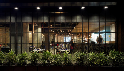
the everyday 'end-to-end' glass facades we see everywhere, here is an entrance
that beckons with its neatly gridded up 'industrial' style cascade of windows,
framed in black aluminum sections with its little canopied logo announcing
Pizza Express.
Warmly lit interiors welcome us into a distinctly industrial flavoured ambience
that engages our senses and urges our eyes to wander. Curiosity is aroused.
.jpg) |
.
|
.jpg) |
.
|
A plethora of
patterns greet us. Upon a closer look, these reveal themselves to be
predominantly utilitarian, and essentially an attribute of the elements they
comprise, seldom used exclusively for aesthetic embellishment. The triumph of
the composition, lies in that, the collage of elements and patterns comes
through as tasteful and intricate, never for a second overbearing or descending
into anarchical confusion.
.jpg) |
.
|
A screen in
core-ten steel frames the entrance passage, and forms an implied partition
between the passage and the seating zone directly in front of it. Electrical
looping expressed as Copper Tubes elegantly weave through the overhead space,
to end in beautiful industrial cage lamps, with long filament Edison bulbs.
These assume orthogonal orientations, twisting and turning overhead in perfect
synchronicity with the seating layout below, and the services above. Some
descend over tables as singular copper lamps, and others culminate in a more
rigid, sentinel -like formation on the walls. At one point, they descend in a
cluster, forming a unique chandelier above one of the tables.
What is striking is the boldness of the lines and zones that define this space
visually. Instead of using the traditional false ceiling, the design goes the
whole hog with the industrial intent, exposing the ducting, acoustics, track
lights, fans and sprinkler systems.
.jpg) |
.
|
Once again, this
is done tastefully, using camouflage to create a 'black zone'. All the services
are painted black, along with the expanse of ceiling that forms their visual
backdrop, extending to the beam bottom.
.jpg) |
.
|
The palette of
colours used comprises mainly of hues of browns and grays. The nature of
finishes used, a combination of timber, concrete, Core Ten and copper, lend a
raw and earthy elegance to the ambience. The flooring for the dining areas is
finished in light wood, planked in a Herringbone pattern, which then continues
on a large expanse of the wall, the colour a shade deeper. The seat cushions
are finished in classy tan leather, and the chairs themselves are a rich oak
brown. The sofas adjacent are upholstered in rich warm gray leather.
.jpg) |
.
|
Continuing with the bold, industrial theme, the columns are finished in Indian
Patent Stone, with the backdrop wall finished in white exposed brick. The white
wall also doubles up as a projection surface. Carefully curated visuals are
projected on to the unconventional screen.
.jpg) |
.
|
This blend of
elements creates a warm and immersive atmosphere. It exudes the class of a
fine-dine restaurant, but does so admirably with the help of elements that you
would seldom associate with one.

well done... Thanks for sharing.
ReplyDelete