Hospitality Design Special
By Marina Correa
By Marina Correa
Photography: Courtesy the architect
 |
| . |
Two terrace restaurants located in Bengaluru and designed by Interface Architecture are interestingly
positioned: one fosters a strong connect with nature, while the other is
inspired by fluidity of form...
Translating the signature
element of a name into a concept, co-principal architect Vijay V Raikar of
Interface Architecture, has developed a fluid yet functional design concept for
S.signature – a new fine-dine restaurant introduced by Swathi, a chain of
Andhra-style restaurants, in Bengaluru.
.jpg) |
| Play of ceiling lighting in dining areas |
.jpg) |
| Bar Counter |
Using clean, soft,
curvilinear and curvaceous lines, the fine-dine experience is broken into three
visual zones; differing in their treatment of furniture and ambience. While the
innermost zone sports a casual but privy feel, the one immediately after and
shielded by the natural roof is anointed with a signature element in the false ceiling;
filled with blue lighting and analogous to the sky. Below, free-flowing granite
flooring outlines the seating layout; with a darker shade enveloping the
circular seating area and the lighter one defining the circulatory path. The third zone - the open-to-sky section is
shielded from the western sun with a glass roof coupled with stone and bamboo
wall cladding to ensure the relaxed feel of outdoor dining.
.jpg) |
| The exclusive Lounge Bar |
A combination of
fluorescent and normal yellow lighting binds the areas, lending them a mood
board that could easily please a variety of senses.
.jpg) |
| Overall view Orchard |
.jpg) |
| Backlit Acrylic |
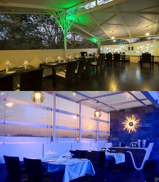
The other restaurant,
Orchard, spread across 2,150 sq ft evolves from the surrounding greenery with
leaf motif fenestrations, tree branch-like roof structure supports and ceiling
patterns designed to follow this concept. A clarity and simplicity of finishes articulates
this entire area as it allows customers to be drawn to the stunning green
vistas all around: flamed granite flooring, stone seating, wicker chairs,
simple glass-topped tables, duco and textured finishes and the like.
.jpg) |
| Outdoor dining area |
.jpg) |
| Waterfall partition between indoor & outdoor |
Though they cater to different
strata of diners, both restaurants are underlined by a modern, minimalistic approach,
proving that good design does not have to be over the top but rather defined
within its context.

The option with steel trusses in a tree shape is the cheap version of the famous 'Tote' restaurant complex by Serie architects at the Mahalaxmi race course in Mumbai.It is shocking to see how people take an inspiration and create a diluted version of it instead of going ahead than it and create some wonderful.
ReplyDeleteEach legitimate business that has extended past a basic eatery and in time made chains of littler eateries or foundations, really began with a similar check list as little eateries do.
ReplyDeleteThis is very informative and interesting for those who are interested in restaurant field. Thank you for such useful information about Food franchising.
ReplyDeleteInterior Designing is popular everywhere. Thanks for the useful information. I hope you will share some more content. Please keep sharing!
ReplyDeleteA very excellent blog post. I am thankful for your blog post. I have found a lot of approaches after visiting your post.
ReplyDelete