By Savitha Hira
Photography: Rajesh Vora &
Samira Rathod; courtesy SRDA
.jpg) |
| . |
An architect’s role goes way beyond building a structure and beautifying
it; the inherent social responsibility is the cornerstone of his/her practice.
Ar. Samira Rathod rises to the occasion.
 |
| . |
Modern lifestyles come with their own distinct dilemmas. Ar. Samira
Rathod’s clients from Ahmedabad, a young couple, wanted their independence without
compromising on the traditional family values.
Orchestrating a design solution that serves on several counts of privacy
for the young couple, holistic blend of new and old – structurally and
emotionally, and keeping her own design diktats in perspective, Samira has
designed an extension of the old home in the backyard, nestled amidst nature
and totally attuned to it. But what started off as a party space three years
ago, has been gradually added on to, and is today, a cozy little home, waiting
to blossom.
.jpg) |
| . |
.gif) |
| . |
Working around the maze of trees, the design of the new block essays three
layers – functionally as well as perceptively: the inner layer is made of glass
and encloses a manicured courtyard, designed as a natural progression of one
from the old house. Responding to the existing box-like full-fledged home theatre
that occupies pride of place in the backyard, the architect has simulated the
intended vocabulary by cladding it with stone fins, giving it a very chic and
intriguing appeal. This sets off the material tone, which then traverses from
glass and stone to exposed and pigmented concrete, wood and bison board,
terrazzo, steel, fabric, mirror and coloured acrylic.
.jpg) |
| . |
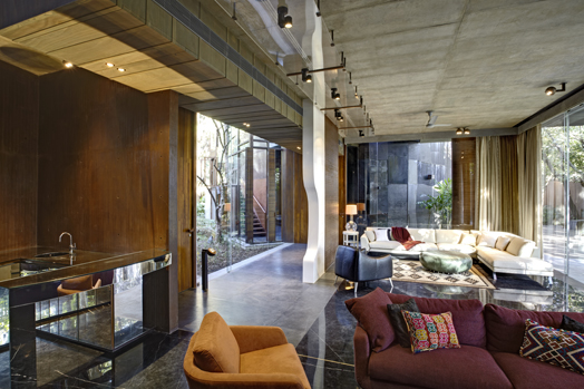
The material palette constitutes the aesthetic and structural vocabulary
of the architecture. Layer 2 made of pigmented concrete forms the middle layer
that defines the spatial layout and layer 3 – the outermost wall is made of
exposed concrete. Furniture follows simple lines; no identifiable style, yet
rooted in comfort and eclectism; some of the pieces designed by SRDA. Overall,
the home generates an interesting meandering of spaces, can comfortably cordon
off the glass façade with curtains for privacy vs. creating a seamless environment
with the old home; is fitted out with wonderful landscaping that adds to its
natural appeal and sports an element of surprise that offers plenty of fodder
for the much-talked-about aftermath of the experience.
.jpg) |
| . |
.jpg) |
| . |
.jpg) |
| . |
.gif) |
| . |
While this assigns the larger picture, concerns that are purposefully
driven are the positioning of windows at a lower level in the bedrooms – to
provide a new perspective to the view outside; quirky elements of fun like the
cycle wheel in the passageway or the balls sunk into the bathroom cabinet to camouflage
the drawer opening; or even the rotund swivel at the bar that can conveniently pass
the glass across to the other section... these premeditated little touches remind one of the lighter side in life.
It is rare to meet an architect, who can look within and pull up her
socks on learnings from the project. While Samira does this with ease, letting
us in on the not-so-apparent shortcomings of the project, we still come away applauding
her attention to detail, spatial composition, play of light, chiaroscuro elements
and overall aesthetic that stand testimony to her maturity and comprehension of
building-to-lifestyle equation.

.jpg)
.gif)
.jpg)
.jpg)
.jpg)
.jpg)
.gif)

.jpg)
Nice one Boss!
ReplyDelete